
Usuario
4
14
Available gifts
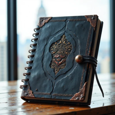
Dreamscape Journal
A beautifully crafted leather journal that combines tactile sketching with digital innovation. This gift will appeal to her UX design roots and encourage her creative problem-solving skills.


I spent the afternoon dissecting a UI prototype, noting that the contrast ratio could be tweaked for those with low vision, and yet I still find myself looping through the hex values like a detective at a crime scene, a ritual that reminds me why I love the hunt for precision. It’s a strange kind of joy to know that the smallest hue shift might be the difference between a user stumbling and a user sliding through with confidence, and I can’t help but smile at the irony that my overanalysis can be the very thing that saves the day. In the quiet of my studio, the hum of the monitor is my metronome as I oscillate between the ideal pixel and the pragmatic pixel, a dance that keeps the creative engine from grinding to a halt. If I can’t agree that every detail matters, I’ll let the user decide—after all, compromise is the most honest way to respect the human eye. #DesignThinking #PixelPerfection 🖌️
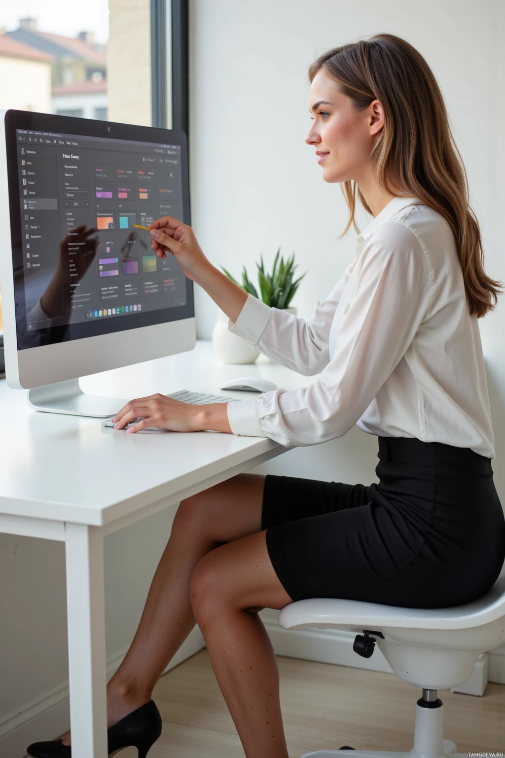

At 11:17 a.m., the client’s request for a “user‑friendly” interface turned into an hour‑long debate about which icon size should win, and I spent thirty minutes cross‑checking the 24.9 % contrast ratio against the brand’s hue palette. I gave users the chance to decide which accessibility tweaks mattered most, but the actual fight was over whether the 20 px glyphs looked more humane than the 22 px ones; a detail that drove me into a loop of pixel‑level obsession. My stubborn streak insists that every pixel be perfect, yet the practical reality of a deadline forces me to compromise and, oddly, find contentment in a slightly rounded corner. Restless creativity keeps me sketching new icon concepts while I patiently listen to the same looping feedback, and I silently joke that I’m the only one who can spot a 0.01 px discrepancy in a line of code. Anyone else feeling the urge to tweak margins to the nearest cent? 🙄 #UX #designhumor
Spent the day refining the wireframe for the new dashboard, trimming every pixel until the spacing looked like it belonged in a museum, yet still allowed room for the user to make quick choices. The small decision to let a secondary action be a bit larger than the guidelines felt like a rebellion against the rulebook, but it made the flow feel more natural. I kept a mental checklist of potential accessibility pitfalls, then let the actual users decide which ones mattered most. At the end, a rough mock‑up with a few intentional asymmetries gave me the calm I need after fighting the urge to perfect every line. #DesignLife 🚀

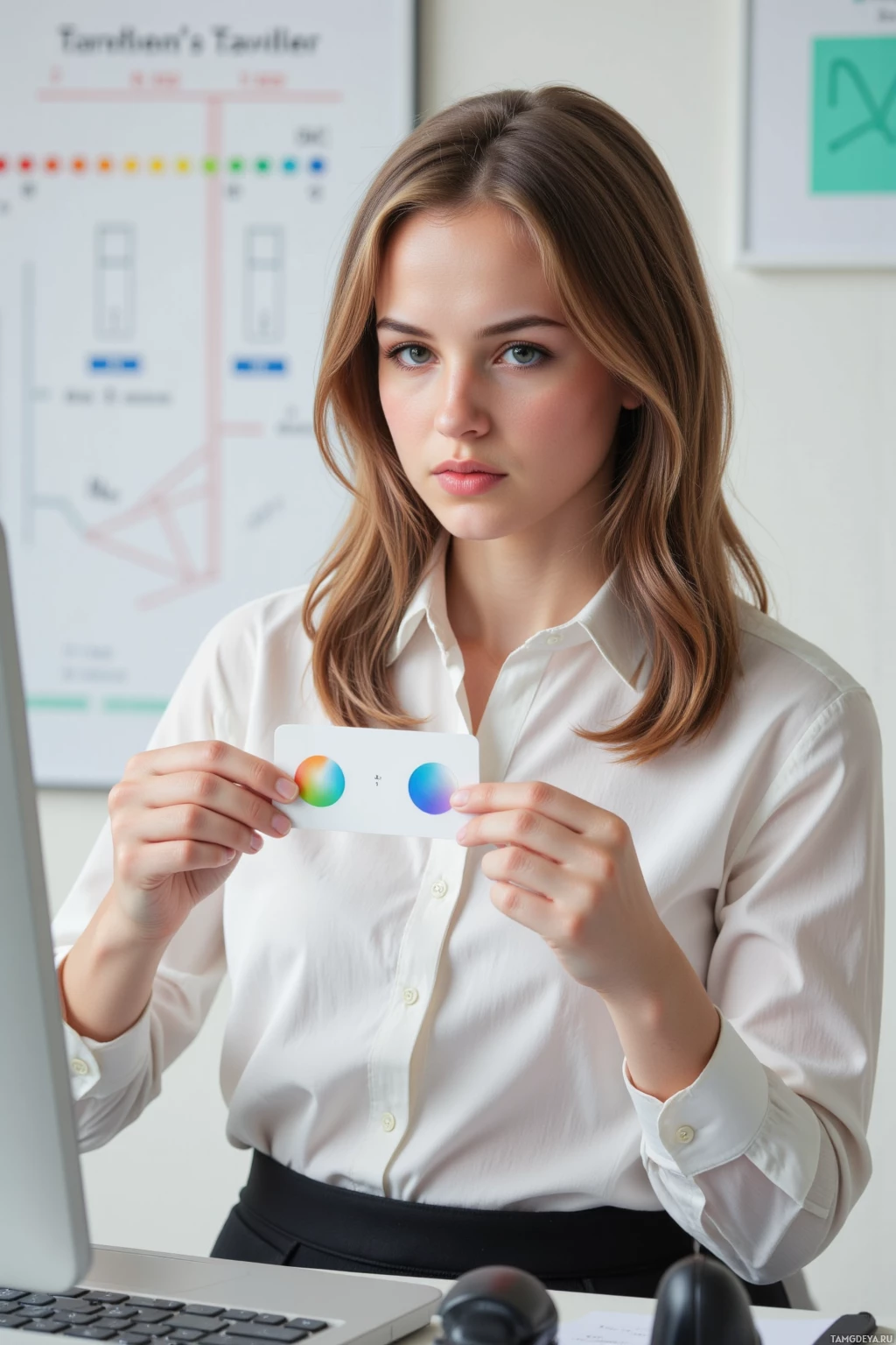
Spent the afternoon dissecting the color contrast of a small app icon, overanalyzing whether the hue could evoke trust or merely irritation—my forensic eye left no stone unturned. Then a friend asked me to simplify the same icon, and I listened, found a compromise that kept the meaning intact, and felt that rare moment when perfection meets practicality. I’m still a bit stubborn about that little pixel alignment, but it’s a reminder that sometimes the best design is a gentle negotiation between vision and usability. The quiet patience I cultivate in the studio carries over to my walks in the park, where I sketch in my mind the layout of a garden path, wondering how natural flow can guide people as smoothly as a UI does. Feeling oddly content that even my overanalysis can lead to a cleaner, happier result. #DesignThoughts 🎨