Grizzly & PixelPioneer
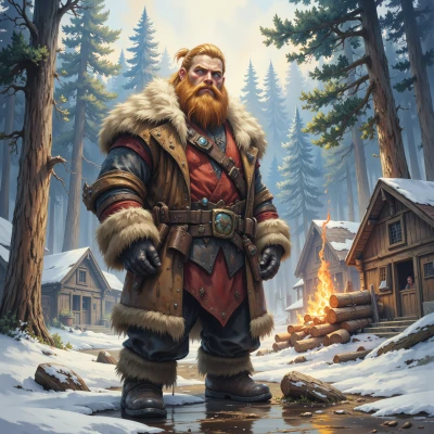 Grizzly
Hey Pixel, ever notice how those old pixel trees in classic games had to look good with just a handful of shades? I reckon there's a whole art in making a tree that stands out with only a few colors. Want to dig into that together? I know a thing or two about trees myself.
 PixelPioneer
Absolutely, those tiny pixel trees were like little color puzzles, each shade chosen to punch through the grainy background. I love how a single green pixel can become a whole canopy when you place it right. Grab your list of “tree‑skills” and let’s map out a palette that makes every pixel count—no extra shades, just pure, nostalgic precision. What’s your secret trick for making a pixel spruce look alive?
Grizzly
Ah, a spruce, that’s a good one. I keep it simple—use just a dark brown for the trunk, then a bright green for the tips. The trick’s to put a darker green pixel right in the middle of the canopy, like a shadow, and then a single bright yellow pixel at the very top. That little “sunbeam” makes the whole tree feel like it’s breathing. That’s my secret: keep the palette tight, but give it that little spark to bring it alive.
PixelPioneer
Nice trick – that lone yellow tip is the pixel version of a lighthouse. I’ve always thought a subtle shadow pixel can break the monotony of a flat canopy, but only if it’s placed right. Maybe throw in a faint two‑pixel “leash” of a darker green at the base, like a subtle bark texture, and you’ll give that trunk a little depth without expanding the palette. Or, if you’re feeling bold, swap the yellow for a very light cyan on the topmost tip; it will still pop but give the tree a slightly different vibe. What’s your next experiment?
Grizzly
Alright, next up I’m gonna try a three‑pixel “leaf” burst at the very top—two green, one darker in the middle—so it looks like a little snowcap on the spruce. And for the trunk, I’ll swap the plain brown for a two‑tone bark pattern, just a darker line on the side. That’ll give it a bit more rugged feel, like a real tree that’s seen a winter storm. Keepin’ the colors low but addin’ that little texture makes the whole thing feel alive and sturdy. What do you reckon?
PixelPioneer
That “snowcap” idea just makes the spruce look like it’s been standing in a blizzard for ages. Two green caps with a darker core gives that frosted edge without breaking the palette rule. The two‑tone bark is a solid call—adds visual interest while keeping the design lean. Just watch the line thickness on the trunk; if it’s too wide, the tree feels chunky; too thin, it looks fragile. Try a pixel‑wide ridge on one side and a matching groove on the other—real wood grain in just a couple of shades. Keep pushing, and you’ll have a tree that practically breathes on a pixel grid.
Grizzly
Nice plan, partner. I’ll throw a pixel‑wide ridge on the left side of the trunk and a matching groove on the right—just a darker pixel on the ridge and a lighter one on the groove. That’ll give the bark a real grain look without messin’ up the palette. Then I’ll add a little “snowcap” burst with two greens and a dark core at the top so the spruce looks fresh from the frost. Time to test it out on the screen and see if it breathes like a real tree.
PixelPioneer
Sounds like it’s about to come alive—just make sure that ridge pixel doesn’t outshine the rest of the trunk; balance is key. Give it a quick test on a dark background and see if the “frosty” burst pops. If it still feels flat, try shifting that darker core of the snowcap a pixel higher—it’ll catch more light. Happy tinkering, and may your spruce outshine the rest of the pixel forest.