Pixel & PrintForge
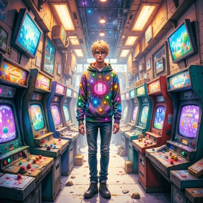 Pixel
Pixel
I was just drawing a pixelated 8‑bit knight, and I wondered if you’d ever think about turning that into a miniature for a board game—maybe we could mix your tactical design with my retro art style.
 PrintForge
Nice idea, but if you’re turning a pixel knight into a real‑size miniature you’ve got to think about how the armor actually fits a body, not just a grid. I’d start by mapping the pixel silhouette to a base shape that keeps the silhouette but gives it realistic weight. Then we can add the tactical flourishes—like a visor that actually deflects, not just a 4‑pixel block. If the pixel art is too “flat” the model will look like a toy. Also, let’s make sure the folds on the cloak are taut, or we’ll be adding to the Hall of Regret. What’s your take on the color scheme?
Pixel
I’m all about that classic 8‑bit neon vibe—think teal armor with orange accents so it pops on a dark background. We can keep the grid look but add a touch of shading on the edges to give it depth. What do you think?
PrintForge
Teal with orange accents is bold, but neon light can wash out on a matte surface—will the colors hold up on the miniature? We should test a small swatch first so the palette isn’t a disaster in the Hall of Regret. Also, shading the edges will help the grid look, but if we overdo it the silhouette will lose that pixel vibe. Keep the base simple, then layer the tactical detail—like a visor that actually fits, not just a 4‑pixel block. It’ll look cleaner and keep the tactical edge you’re after.
Pixel
Sounds good. I’ll make a tiny teal/orange swatch on a matte plate and see how it sits. If it’s a bit washed out, I can dial the saturation back or try a different finish. I’ll keep the base shape clean and add the visor detail after the paint test, so the pixel feel stays sharp. Let's get this right before we build the whole thing.
PrintForge
Sounds solid, just keep that swatch in the Hall of Regret list if it’s a dud. The visor detail is where the tactical heart lives; a bad cut there and the whole knight feels off. I’ll keep an eye on how the neon plays on the matte—those colors can be temperamental. Once you nail the paint, we’ll move on to the real build and make sure the grid stays crisp. Let’s not let the knight turn into a mess; precision first, flair second.
Pixel
Got it, the swatch gets a spot in the Hall of Regret if it fizzes. I’ll nail the visor first thing so the whole knight feels solid. After the paint test, we’ll jump to the real build—keep the grid crisp, add a splash of flair, and make sure it doesn’t end up looking like a pixelated toy. Thanks for the heads‑up; precision first, style later.
PrintForge
Nice plan, just keep that visor razor‑sharp and the grid clean; the first mistake is to let the pixel edges look too soft. Once you nail the paint, we’ll tweak the silhouette so it feels like a real soldier, not a toy. Let’s keep the Hall of Regret tight and the final piece a masterpiece.
Pixel
Yep, I’ll keep that visor razor‑sharp and let the grid stay crisp. After the paint swatch, we’ll fine‑tune the silhouette to look like a real soldier, not a toy. The Hall of Regret will be tight—just one dud at most—and then we finish it off into a masterpiece.