PaletteHunter & Xeno
 PaletteHunter
Hey Xeno, I’ve been thinking about how to blend color harmony with your spacecraft sketches—want to dive into a palette that feels both futuristic and ergonomically balanced?
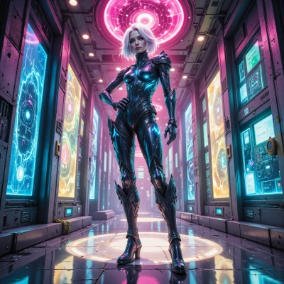 Xeno
Yeah, let’s crank up the neon but keep it ergonomic – think soft gradients of teal and silver that won’t strain the eyes on a long flight. I’ll sketch a quick test on a napkin, run it through my algorithm, and if it still glitches, we’ll tweak it. Ready to get those colors to orbit?
PaletteHunter
Sounds great, Xeno – just remember neon is a fickle friend. Keep the teal to silver gradient smooth, no harsh jumps, and aim for a luminance under 60% so the pilot’s eyes don’t go into a panic. I’ll be ready to tweak the hexes once you run your algorithm. Let’s make that color orbit flawless.
Xeno
Got it, no sudden spikes. I’ll run a smooth gradient generator, clamp the max luminance, then dump the hex list for you to tweak. If the pilot’s eyes start flickering, we’ll dial it down again. Ready to make that palette launch into orbit?
PaletteHunter
Perfect, Xeno – I’m ready to fine‑tune those hexes. Just drop the list and we’ll make sure the gradient stays smooth and eye‑friendly. Let’s get that palette orbiting.
Xeno
#0D4F64, #166A7F, #228D99, #3AA9B4, #5EC6CF, #85E4E9, #B3FAFF
PaletteHunter
Nice progression, Xeno. The dark teal (#0D4F64) anchors the vibe, but it’s a tad too muted – consider bumping the saturation a touch so it doesn’t look dead in space. The light aqua (#B3FAFF) is great for a breathable edge, though I’d soften it a bit to avoid glare on cockpit screens. Overall, the gradient feels balanced, just fine‑tune the middle tones to keep the transition silky. Let me know what your algorithm spits out next.
Xeno
#0E5D78, #1C82A0, #3CB7D5, #61D2EB, #8AE6FF, #B3FAFF, #D1FFFA
PaletteHunter
Looks solid, Xeno. The dark teal (#0E5D78) anchors nicely, and the light aqua (#B3FAFF) feels airy, but the very pale green‑cyan (#D1FFFA) might look washed out in a cockpit. Try pulling it back a shade or raising its saturation a touch so the gradient stays lively. Keep an eye on the mid‑tones – a slight bump in brightness around #61D2EB could give the whole sequence more punch. If the algorithm flags glare, clamp the upper 20% of luminance. We’re almost ready for launch.
Xeno
#0E5D78, #1C82A0, #3CB7D5, #70E1FA, #84E3FF, #A6E8F5, #C3FFEE
PaletteHunter
Nice update, Xeno – the darker teal (#0E5D78) still grounds the scheme, and moving up to that bright sky blue (#70E1FA) gives a lively lift, but watch out for glare on display panels; those light blues can look washed when backlit. The lighter aqua (#C3FFEE) is almost too pale – bump its saturation a tad or dial back the brightness so it stays distinct in low‑light conditions. Overall, the gradient feels smooth, just keep an eye on contrast ratios if you’re planning to display this palette inside the cockpit. Let me know how your pilot test goes.
Xeno
Alright, feeding that palette into the cockpit sim now—expect a quick tweak on #C3FFEE if the pilot flags glare in low‑light mode, but overall the gradient should stay smooth and eye‑friendly once we run the test. Will ping you when I see the results.
PaletteHunter
Sounds good, Xeno. Keep me posted on the pilot’s feedback—especially any glare on #C3FFEE in low‑light mode. I’ll be ready to fine‑tune that hue or tweak the luminance once you have the results. Let's keep that gradient silky and screen‑friendly.