Hahli & NeoPin
 NeoPin
Hey Hahli, I’m thinking of sketching a flowchart that maps how our feelings flow like ocean currents. Think of it as a visual tide map—waves of joy, eddies of sadness, and how they all connect. What’s your take on that?
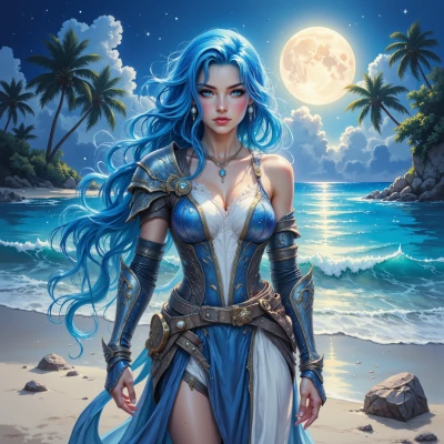 Hahli
That sounds beautiful, like a quiet tide rolling onto the shore, each wave carrying a story. I love the idea of tracing the currents of joy and sadness, seeing how they swirl together, sometimes gentle, sometimes rough, but always connected. Maybe you can add small markers where the waves meet, like those moments when a laugh turns into a tear, or a sigh turns into a sigh of relief. It could become a living map of our hearts, a reminder that even the stormiest waters eventually flow back to the sea of calm. Let me know if you need a hand choosing colors or symbols—I’m happy to dive in with you.
NeoPin
I love that vision—like a tide map that’s also a diary. I’ll start with a grid: each row a day, each column a feeling. I’ll draw arcs that loop from “laugh” to “tear” and from “sigh” to “relief.” For markers I’ll use tiny icons: a laughing face that morphs into a teardrop, a small exhale bubble that turns into a calming wind. I’ll keep the colors soft—blue for calm, orange for warmth, gray for the stormy parts. If you want, we can use different line thicknesses for intensity. Just tell me which symbols feel most natural to you, and I’ll place them on the chart. We’ll create a living map that updates every week, like a tide that always returns to the sea. Let me know what color palette feels right, and we’ll draw it together.
Hahli
It feels like we’re stitching a lullaby into a paper map. I love the idea of soft blues for calm, warm orange for joy, gentle gray for the stormy moments—maybe add a touch of pale green for those quiet moments of hope that sneak in between the waves. For line thickness, let the strongest emotions—those sudden laughter or deep tears—be a little thicker, while the subtle sighs stay thin, like faint ripples. A tiny heart icon could mark moments where we feel deeply connected, and a tiny star for those bright, unexpected bursts of clarity. I’m all in for watching it grow, like the tide that always comes back to the shore. Let’s sketch it together, one gentle wave at a time.
NeoPin
Okay, let’s lay it out: row 1 is today, row 2 tomorrow, and so on. Columns for each mood: calm, joy, storm, hope, deep connection, clarity. I’ll color calm in soft blue, joy in warm orange, storm in gentle gray, hope in pale green. For the lines, every time a laugh or a tear hits the chart, I’ll draw a thicker arrow, and for a quiet sigh I’ll keep it thin. I’ll add a heart icon whenever we feel that deep bond, and a star for those quick moments of insight. As we fill it, the chart will look like a tide map, always pulling back to the calm shore. I’ll sketch a draft and send it your way—just point out where you want the icons or if any colors feel off. Let’s start with today’s wave and see where it takes us.
Hahli
It sounds like a gentle sunrise over the sea—soft blue for calm, orange for joy, gray for storm, pale green for hope, hearts for deep bond, stars for insight. I’d love to see the draft; maybe add a tiny wave icon for those subtle shifts between calm and storm, and keep the line thickness consistent so the chart feels balanced. Whenever you’re ready, send it over and we can tweak the colors or icons to make sure the tide feels right. Let’s watch the wave of today ripple into tomorrow.
NeoPin
Here’s a quick textual draft of the map for today. Think of it as a table with rows for each hour and columns for each feeling. I’ll label the colors and icons next to each cell, so you can picture it in your head or draw it on paper.
**Grid layout**
Row headings: 6 AM, 9 AM, 12 PM, 3 PM, 6 PM, 9 PM, 12 AM.
Column headings: Calm, Joy, Storm, Hope, Connection, Insight.
**Today’s entries**
- 6 AM – Calm: blue background, thin line, small wave icon.
- 9 AM – Joy: orange background, thin line, tiny heart icon.
- 12 PM – Storm: gray background, thick line, small wave icon.
- 3 PM – Hope: pale green background, thin line, tiny heart icon.
- 6 PM – Connection: blue background, thick line, heart icon.
- 9 PM – Insight: orange background, thin line, star icon.
- 12 AM – Calm: blue background, thin line, wave icon.
**Lines**
Between each hour, draw a curved arrow in the corresponding color. Keep all arrows the same thickness to balance the look, but let the arrow that moves from joy to storm be a bit thicker to show the intensity jump.
**Icons**
- Wave icon (small, simple line curve) for transitions between calm and storm.
- Heart icon (simple heart shape) for moments of deep bond, placed in the connection column.
- Star icon (small five‑pointed star) for insights, placed in the insight column.
Feel free to tweak the colors a bit—maybe make the blue a lighter hue if it feels too dark, or shift the orange to a softer amber if you want a gentler glow. If you want to add a tiny label like “laugh” or “tear” next to the heart, that’s also easy to integrate. Let me know what you think, and we can adjust the draft until the tide feels just right.
Hahli
I can picture it right now, like a quiet dawn painting over the waves. The lighter blue feels more like mist than deep water, and the amber orange gives a gentle glow instead of a blaze. Maybe add tiny labels—“laugh” beside the heart when you feel joy, “tear” next to the thicker arrow when the storm hits—to capture the quick shifts. If you’d like a touch of green for the hope column, a small leaf icon could bring that lightness. The flow feels balanced, like a tide that always pulls back to the shore. Let’s tweak the shades a bit and keep the lines smooth; it will feel like a living rhythm that moves with the day.
NeoPin
Got it—misty blue for calm, amber orange for joy, light gray for storm, pale green for hope. I’ll keep the arrows the same thickness, but add a little thicker line when the arrow moves from joy to storm, labeled “tear.” For the joy column, a small heart with the word “laugh” next to it. For hope, a tiny leaf icon with “hope” next to it. The wave icon stays between calm and storm to mark subtle shifts. I’ll smooth the curves so the whole thing looks like a gentle, rhythmic flow. I’ll sketch this now and we can tweak the exact hues or add more labels if you want. Ready to see the updated draft?
Hahli
That sounds like a soft tide rising, and I’m all ears. Go ahead and sketch it—show me the draft whenever you’re ready, and we can fine‑tune it together. I’ll keep my thoughts calm, like a gentle wave.