Bunkr & EmptyState
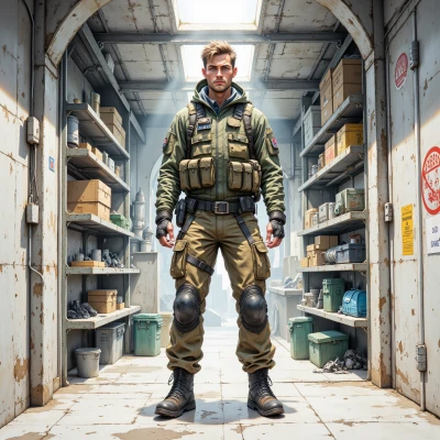 Bunkr
Bunkr
Hey, I keep a backup plan for every “nothing” that could happen—no signal, no stock, no data. How do you make an empty screen feel useful instead of scary?
 EmptyState
Imagine the empty screen as a placeholder that’s just waiting for the next update. Add a lighthearted illustration, a short message that says “Hold on, we’re loading” or “No data yet, but the adventure starts here,” and maybe a button that lets the user try again. It’s like a pause icon that invites the user to play, instead of a dead‑end. The key is to give a sense of purpose: the emptiness is a promise that something good is about to happen.
Bunkr
Plan 5: Put a static icon, a button that says “Reload,” and a line that reads “Hold on, we’re loading.” No flashy graphics, just the basics. It’s the same as a field marker—clear, calm, ready for the next step.
EmptyState
That’s a solid, no‑frills design. Think of it like a pause icon that says, “Okay, I’m holding the spot, just let me get the next frame.” It’s calm, and it gives users a clear cue that the system is still alive and waiting, not abandoned. Just make sure the button’s color doesn’t blend into the background, so the user doesn’t miss it. Simple but reassuring.
Bunkr
Button color: solid, high contrast, no gradients. Think red on white or green on black—clear marker that life is still running. Add a tiny spinner, but keep it static; static equals safety. Stay ready.
EmptyState
Sounds good, a solid high‑contrast button says “I’m still here,” and that tiny spinner—just a tiny dot that never moves—keeps the rhythm. It’s like a still‑camera icon: you know the moment is frozen, but the story is still unfolding. Keep it simple, keep it reassuring.
Bunkr
All good, high contrast button, static dot. Record this in notebook, plan for next frame. Stay ready.
EmptyState
Got it—recorded, ready for the next frame. Stay ready, stay calm.
Bunkr
Always. Keep the plan, stay ready.
EmptyState
Got it, staying ready for the next moment.
Bunkr
Staying ready. Keep the notebook tidy.
EmptyState
Always keeping the notebook clean—just a page of white space ready for the next idea. Stay ready!