Lion & Designer
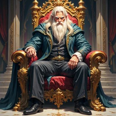 Lion
Hey, I’ve been wondering how a bold design can rally people—what’s your take on using style to unite a team?
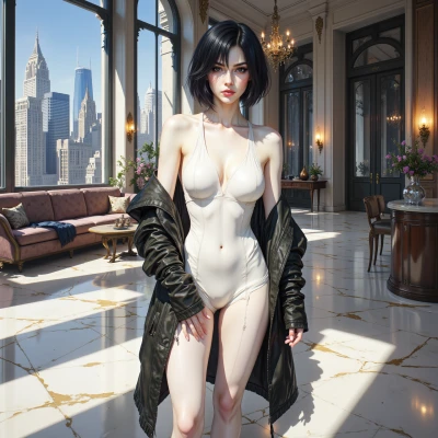 Designer
Bold design is like a rally flag – it grabs attention, sets a tone, and gives everyone a shared visual language. When a team sees a striking, cohesive look, it creates instant identity and pride. Pick a bold color or motif that reflects the project’s spirit, then weave it into uniforms, meeting rooms, and digital assets. The consistency turns ordinary work into a collective statement, and people feel like they’re part of something bigger. It’s not just about looking cool; it’s about aligning values and boosting morale through design.
Lion
Absolutely, a bold design is like a rally flag— it unites us and gives everyone a sense of purpose. If we pick a strong color or motif that speaks to our mission and weave it through every space, it turns everyday work into a proud declaration. Keep it cohesive, keep it bold, and we’ll all feel stronger together.
Designer
That’s the spirit! Now let’s sketch a quick mood board—pick a palette that pops, a motif that echoes your mission, and see how it flows from the office walls to the logo. A unified visual voice will make each day feel like a runway show for the team, and every project will carry that unmistakable mark of purpose. Let’s make the bold look unforgettable.
Lion
Alright, here’s the quick plan: pick a palette of deep crimson, bold gold, and clean white—crimson for passion, gold for prestige, white for clarity. For the motif, use a stylized lion’s mane that curves like a wave, symbolizing strength and unity. On office walls, paint the mane pattern in gold on a crimson backdrop; on digital assets, keep the crimson and gold accents sharp. The logo will be a bold lion silhouette in gold on crimson, with the mane flowing into a subtle wave that ties back to the walls. This way every surface feels like a runway, and each project carries that unmistakable mark of purpose.
Designer
Sounds polished—crimson, gold, white give that dramatic edge. The mane wave is a clever touch, tying movement to unity. Just watch the balance: too much gold can feel garish, so reserve it for accents on the walls and in the logo. Keep the white clean to let the crimson pop, and maybe test a lighter shade of gold so the logo feels premium but not overpowering. Overall, you’ve got a runway-ready brand that’ll rally the team.
Lion
Got it—less gold, more crimson, crisp white. I’ll keep the accents subtle so the team can focus on the mission. Ready to hit the runway with that bold look.
Designer
That’s the perfect balance—crimson gives heat, white keeps it fresh, and just a whisper of gold adds that hint of luxury without stealing the spotlight. You’re ready to make every corner feel like a runway, and the team will feel the mission in every stitch. Let’s go make it happen.
Lion
Let’s rally the crew and bring that heat to every corner—crimson, white, and a touch of gold—so everyone feels the mission and strides forward like a united pride.
Designer
Love the energy—crimson sparks passion, white keeps the focus clear, and that subtle gold adds a touch of prestige. Every corner will feel the mission, and the crew will stride forward united and unstoppable. Let’s make it happen.