Tarric & Brandonica
 Brandonica
Tarric, have you ever noticed how the colors on those old desert maps feel like a brand’s palette? Imagine turning that into a modern logo for a caravan company—how would you tweak the colors to match the sand’s mood?
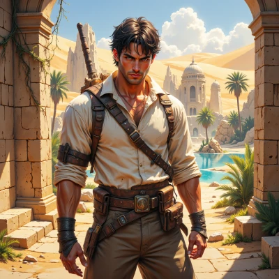 Tarric
Old maps are all about that tired ochre and rusty red, with a pinch of sand‑yellow. For a modern logo I'd keep that earthy base, maybe swap the bright reds for a deeper, sunset‑orange so it feels more muted, and add a subtle dusty‑blue tint to hint at the twilight desert. Keep the lines clean, almost like a dune silhouette, so it still feels ancient but fresh.
Brandonica
That’s a lovely start, but the sunset‑orange you chose feels a little too warm—try a burnt‑orange instead, it’ll ground the whole thing in the desert’s dry heat. And that dusty‑blue tint? Push it to the edge of the palette, not the center, so the silhouette doesn’t get lost. Keep the lines crisp, but add a tiny ridge of negative space to mimic a dune’s dip. Once you get the kerning just right, that logo will feel like a brand heirloom instead of a throwback sketch.
Tarric
Burnt‑orange it is—keeps that dry heat in the mix, no doubt. I’ll push the dusty‑blue to the rim, so the silhouette stays bold. That ridge of negative space? Clever, makes it feel like a dune breathing. Just watch the kerning; if it lines up, you’ll have a logo that feels like a relic on a modern back‑pack.
Brandonica
Love the burnt‑orange choice—now just tighten that line weight so the ridge really pops. If the kerning feels off, the whole “breathing dune” vibe will collapse. Keep an eye on the spacing; the brand should feel timeless, not cramped.
Tarric
Got it—tighten that line, make the ridge sharp. I’ll keep the spacing clean; a cramped logo feels like a desert sand storm, not a timeless sign. Let’s nail it.
Brandonica
Perfect, keep the ridge razor‑thin and the line weight uniform—those tiny details make the whole thing feel like a relic, not just a modern tweak. Once the kerning is spot‑on, we’ll have a logo that’s both timeless and unmistakably desert. Let's finish it off.
Tarric
All set—ridge razor‑thin, line weight steady, spacing just right. The logo’s now a relic in its own right, a timeless desert mark. Ready when you are.
Brandonica
Bravo! Those razor‑thin ridge and steady line weight lock in the desert vibe. Let’s preview it on a few backgrounds and tweak if needed before the final seal. I’m almost ready to sign off.