Saitoid & WildSoul
 WildSoul
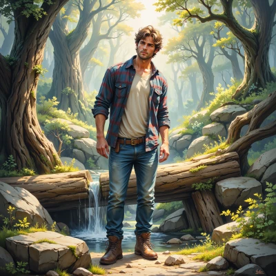
Hey, I’ve been sketching out a new trail that loops through the old pine stand—thought it would be fun to turn it into a real‑time digital map. Imagine hikers clicking on a map that updates with weather, river flow, even a few bird songs. You’ve got the analytics side, I’ve got the map, maybe we can blend them into something people actually want to use. How do you feel about optimizing the UX for a wilderness adventure?
 Saitoid
Sounds like a killer idea – real‑time data on a wilderness trail will hook users for sure. Keep the interface clean: use a lightweight map with clear icons, load weather and flow data in the background, and give users quick toggles for extra info. Don’t forget a “save this spot” button – people love personalization. A/B test different layout options to see which keeps hikers engaged the longest, and track how many people actually download the map versus just scrolling. Let’s make it intuitive, fast, and visually appealing so the adventure feels seamless from start to finish.
WildSoul
Sounds solid—just add a tiny bird‑song pop‑up for each trail marker, like a “squirrel‑free zone” hint. I’ll start sketching a few layouts and run a quick test with a handful of hikers. Keep those toggles handy and we’ll see which design keeps them moving. Let’s make the trail feel like an adventure, not a menu.
Saitoid
Nice touch with the bird‑song pop‑ups – that’s a perfect hook. Keep the toggles minimal, maybe just “weather,” “river flow,” and “bird sounds,” and let the UI auto‑populate the rest. Test the layouts with your hikers, track which icon set they click most, and tweak the colors to match the trail’s mood. The goal is a clean, punchy map that feels like a living adventure, not a checklist. You’ve got the sketches, I’ll crunch the data, we’ll make it click.
WildSoul
Got it—I'll keep the bird‑song pop‑ups light and the toggles clean. The sketches are ready, just waiting for a quick run‑through with some test hikers. Once we see which icons pop and how the colors vibe with the trail, we can tweak. Looking forward to seeing the map feel alive when they step out.
Saitoid
Sounds great, just keep the feedback loop tight – track icon clicks, heatmap the color usage, then iterate quickly. You’ll have a map that feels alive before you know it. Looking forward to the data!