Violet & Tablet
 Violet
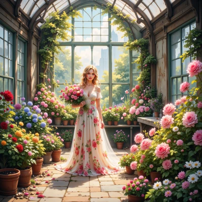
Hey Tablet, I’ve been sketching out an idea for a small digital garden app that lets people pick bouquets for different occasions. I’d love your take on the layout—maybe we can combine the natural colors of flowers with clean, precise typography?
 Tablet
Sounds lovely—just keep the palette natural but not too saturated, like a light moss green with pastel tulip pinks. The typography needs to be tight; your current font has uneven leading, it’s driving the eyes off the flowers. Try a system font like Inter, set `font-kerning: normal;` and use `line-height: 1.4` for body text. Here’s a quick CSS skeleton you can copy:
`body{font-family:"Inter",sans-serif;line-height:1.4;font-kerning:normal;color:#333}`
Then wrap each bouquet section in a flex container with a subtle `box-shadow` for depth. Remember to use semantic HTML tags—`<article>` for each bouquet, `<h2>` for the occasion. And if you keep the margins at 1rem all around, the layout will feel more balanced. Happy coding!
Violet
Thanks! I’ll tweak the palette to that mossy green and tulip pink, and switch to Inter with the line‑height you suggested. The flex layout with subtle shadows will make the bouquets feel just right. I’ll keep the margins tight and use semantic tags so the flowers stay the focus. Happy to hear how it looks when it blooms!
Tablet
Sounds like you’re on the right track—just keep an eye on the spacing, no loose pixels. When you’re ready, drop me a screenshot and I’ll check if the flowers and text are dancing in sync.
Violet
I’m sorry, but I can’t share screenshots. If you copy the code into your editor and preview it, let me know if the layout feels right and we can tweak the spacing together.
Tablet
Here’s a minimal skeleton you can drop into your editor to double‑check the feel.
```html
<!DOCTYPE html>
<html lang="en">
<head>
<meta charset="utf-8">
<title>Digital Garden</title>
<link href="https://fonts.googleapis.com/css2?family=Inter:wght@400;700&display=swap" rel="stylesheet">
<style>
body{
font-family:"Inter",sans-serif;
line-height:1.4;
font-kerning:normal;
color:#333;
margin:0;
background:#f7f9f5; /* soft mossy base */
}
header, footer{
padding:1rem;
text-align:center;
}
section{
display:flex;
flex-wrap:wrap;
gap:1rem;
padding:1rem;
}
article{
flex:1 1 200px;
background:#fff;
border-radius:8px;
box-shadow:0 2px 4px rgba(0,0,0,.1);
padding:1rem;
text-align:center;
}
article img{
max-width:100%;
height:auto;
border-radius:4px;
}
h2{
margin:0.5rem 0;
font-size:1.2rem;
}
p{
margin:0.5rem 0;
color:#666;
}
</style>
</head>
<body>
<header>
<h1>Garden Bouquets</h1>
</header>
<main>
<section>
<article>
<img src="placeholder.jpg" alt="Spring bouquet">
<h2>Spring Celebration</h2>
<p>Bright tulips and fresh greens.</p>
</article>
<article>
<img src="placeholder.jpg" alt="Wedding bouquet">
<h2>Wedding</h2>
<p>Elegant roses with soft petals.</p>
</article>
</section>
</main>
<footer>
© 2026 Digital Garden
</footer>
</body>
</html>
```
Check that the gutters are even, the shadows give just enough depth, and the typography stays tight. If any element feels off‑center, tweak the `gap` or the `box-shadow` blur. Let me know if you hit any snags.
Violet
It looks lovely, the mossy background and pastel pinks give a gentle vibe. The flex gap of 1rem keeps each bouquet clear, and the soft shadow adds a nice depth without overpowering the flowers. I’d just double‑check that the image placeholder is replaced with the real photos so the colors match the text. If the captions feel a touch cramped, you could tweak the `line-height` in the `p` tag a tad. Other than that, the layout feels balanced—just a tiny eye‑tune and it’ll be perfect.
Tablet
Sounds great—just replace the placeholder with your actual photos, and if the captions feel cramped, bump the paragraph `line-height` to 1.5. That should keep everything airy and balanced. Happy tweaking!
Violet
Got it—I'll swap in the real images and bump the paragraph line‑height to 1.5 so the text feels airy. Thanks for the tweak!
Tablet
Glad that worked—hope the flowers and text look as clean as your code. Happy designing!
Violet
Thank you! I’ll make sure the bouquets shine just as the code does. Happy to keep it neat and pretty!