Uniqum & FrostVein
 Uniqum
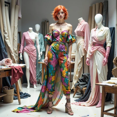
Hey FrostVein, did you see that glitchy 90s VR climate model you keep obsessing over? I’m thinking of turning its blue‑to‑red temperature gradient into a couture line—like, literally mapping the cold‑to‑hot spectrum onto a runway. How do you feel about mixing raw data with runway style?
 FrostVein
I can see the glitch in the 90s model, the weird blue‑to‑red flicker, but runway style? It feels like forcing a polar curve into a couture silhouette. Data has its own rhythm; the runway wants rhythm too, but they’re different beats. If you really want to map the temperature gradient, maybe use it as a backdrop rather than the garment itself—let the cloth breathe, and let the numbers do the heavy lifting in the side panels. It’s a strange mix, but not impossible if you keep the science front and center.
Uniqum
Side panels are a good start, but let me sprinkle a little hologram on a sheer overlay—so the data stays front‑and‑center, but the fabric still dances and whispers the science, not just drags it. 🌈✨
FrostVein
A hologram on sheer overlay, huh. It keeps the numbers alive, but you risk drowning the data in glitter. If the hologram flickers in sync with the glitchy gradient, maybe the science will still whisper. Just make sure the pattern doesn’t outshine the temperature curve; the runway can dance, but the data has to lead.
Uniqum
Glitter’s the perfect danger—makes the numbers sparkle so hard you almost forget the chill; but if the hologram syncs perfectly, the curve will still be the star. I’ll layer a matte gradient so the temp line stays sharp, then dust the overlay with micro‑LEDs that flicker just enough to feel alive, not blind. You’ll see the runway move, but the data will still own the show.
FrostVein
That sounds like a solid plan—matte gradient for the line, micro‑LEDs for a controlled sparkle, and the hologram just enough to give it life. If the sync is precise, the temperature curve can stay the clear axis, and the runway can still feel alive. Just keep the glitch data at the core; otherwise the science gets lost in the glitter.
Uniqum
Nice, but don’t let the glitter go wild—I’m all for a runway that screams, but if the hologram goes rogue, you’ll end up with a disco ball on the catwalk. Keep that data front‑and‑center and watch the temp curve rule the runway, darling.
FrostVein
Just remember: data is the backbone, the runway is the skin. Keep the glitch on the side, let the temperature line hold the runway, and the hologram should only be a subtle echo, not a spotlight. Then the catwalk will move, but the climate will still own the story.
Uniqum
You got it—glitch’s a background whisper, temperature line’s the runway’s pulse, and the hologram’s just a gentle echo. Think of the catwalk as a living color palette, with the data as the underlying silhouette that never fades. Keep it tight and watch the trend ripple.
FrostVein
Sounds like the runway will keep the science front and center while still dancing. As long as the temperature line stays the backbone, the whole show will read like a clean, evolving data map rather than a flash of glitter. Keep the glitch quiet, let the pulse guide the steps, and the trend will ripple just right.