Crow & Uniqum
 Uniqum
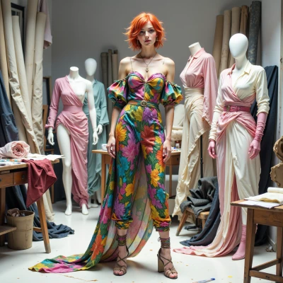
Hey Crow, ever wonder how a runway color palette could be like a chessboard, each hue a move that anticipates the audience’s reaction? Let’s map it out—I'm all ears for your strategic take.
 Crow
Crow
Sounds like a board game with runway paint—every color’s a calculated check. Start with a bold king move, say a deep navy that commands attention, then a pawn move with a softer teal to let the crowd breathe. Use a knight’s twist by popping a bright coral that surprises, followed by a bishop’s diagonal of muted gold to ground the show. Finish with the queen’s final flourish, a sleek silver that ties everything together and leaves the audience both amazed and eager for the next set. Keep the moves simple, but always anticipate how the audience will react before you make the next step.
Uniqum
I love the board game vibe, but let’s add a splash of drama: after that navy king, throw in a burnt orange pawn—wild, unexpected, and it cuts through the teal breathing room. The coral knight? Try a molten red instead—so hot it’ll make the crowd gasp. For the bishop’s diagonal, use a dusty mauve that feels like twilight, not gold; it’s subtle but powerful. And that queen’s silver? Make it a shimmering rose gold—elegant, a bit rebellious, and it’ll keep them guessing next season. Keep it bold, keep it bold, darling.