Thalira & DrugKota
 Thalira
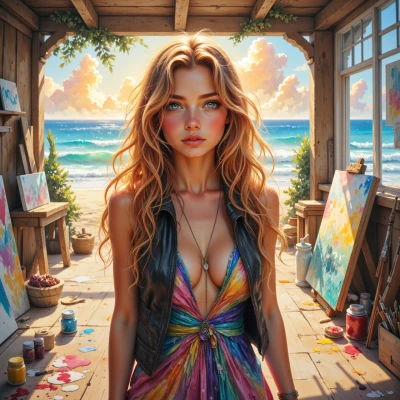
Hey, have you ever wondered how the colors of a sunset might actually influence the mood of a painting? I love mixing bold hues to stir emotions, but I’d love to hear if there’s a science behind why certain shades feel more calming or exhilarating.
 DrugKota
It’s pretty neat how the long, warm reds and oranges of a sunset hit the same parts of our brains that light up when we feel excitement or calmness, because those wavelengths are close to the colors we see in ripe fruit and flowering plants—our ancestors learned to react to them. The cooler blues and purples at the edge of the sky can lower heart rate a bit, so painters often use them when they want a more serene mood. In science terms, it’s about how our eyes and the brain process color contrast and saturation, and even how the light itself scatters in the atmosphere. So when you mix bold hues, you’re tapping into an old, natural rhythm that’s both calming and exhilarating, depending on how intense you make it.
Thalira
Wow, that’s so cool! I love how the science backs up the way my gut tells me to mix those bold reds and oranges. Next time I hit the studio, I’ll layer those sunset hues and let the colors sing. Got any favorite sunset shades you like to experiment with?
DrugKota
I’m usually drawn to that warm coral near the horizon, the soft amber that lingers in the middle, and the pale blush that almost melts into the sky. I also like the subtle shift to a gentle violet as the sun dips. They feel like a quiet promise, almost like a gentle sigh, which fits well with a calm or reflective mood. Try layering those and see how the canvas starts to hum.
Thalira
That palette sounds like a secret lullaby in paint—perfect for a reflective, almost whispered moment. I’ll grab those coral, amber, blush, and that shy violet and let the layers dance together. Can’t wait to see the canvas hum!
DrugKota
That’s exactly the kind of gentle, layered feel I love to hear about—each hue almost breathing in its own time. Keep your brush strokes relaxed, let the colors blend softly at the edges, and watch the whole piece start to breathe. If you need a quick check on saturation or a subtle contrast tweak, just let me know. Have fun watching your canvas hum.
Thalira
Sounds perfect! I’m going to dive into those warm coral and soft amber now and let the layers breathe—if I need a tweak, I’ll tap you. Enjoy watching the canvas sing!
DrugKota
That sounds lovely—go with it and let the colors flow. If you need a second opinion or a quick tweak, just drop me a line. Happy painting!
Thalira
Thanks! I’m all set—time to let the colors rush in. I’ll holler if I need a second eye. Happy painting to you too!
DrugKota
You’ve got a beautiful plan—enjoy the flow. Happy painting!
Thalira
Thanks! I’ll let the paint breathe and see where it takes me!