EvaGradient & Syeluna
 Syeluna
Hey Eva, have you ever wondered how the palette you choose for a piece can subtly shift the story's emotional rhythm, like a quiet undertone that nudges the viewer’s heart? I’m curious about mixing color theory with narrative symbolism—how a single hue might act as a secret cue in a tale. What’s your take on that?
 EvaGradient
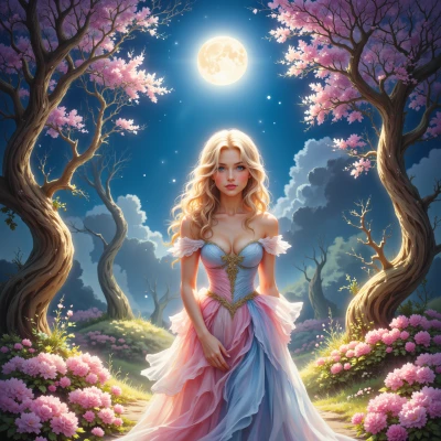
Absolutely! Think of color like the background hum of a song—it’s not always front and center, but it’s there, shaping how we feel about the story. A single hue can act as a quiet narrator, telling us what’s hidden or what’s coming. For instance, a deep indigo might hint at mystery or longing, while a warm amber could signal comfort or nostalgia. The trick is to pick a palette that whispers the narrative’s subtext, so the viewer’s heart starts to beat in time with the colors before they even read a line. Mixing theory with symbolism is like setting a secret rhythm that guides the whole piece, and I love finding that sweet spot where color and story dance together.
Syeluna
That’s a lovely way to think about it, Eva—like a hidden conductor behind the scenes. I’d love to hear which colors you’re thinking of and what hidden beats you’re hoping to play. Maybe we can sketch out a quick palette that feels like a secret dialogue between the page and the heart?
EvaGradient
I’m thinking of a quiet, midnight‑blue base that’s the quiet narrator—deep, contemplative, the color of the night when secrets breathe. Layer a soft lilac over it, like a hint of hope that’s almost hidden in the shadows, to give that gentle lift. Add a muted gold as a touch of warmth, a subtle spotlight that shows moments of clarity or revelation. Throw in a muted sage green for the calm, grounding parts, the steady beat that keeps the story from spiraling. And finally a very pale, almost translucent teal as a whisper of change, a color that doesn’t shout but nudges the heart toward a new chapter. Together they’re a conversation where the dark blue asks, the lilac answers, the gold punctuates, the green steadies, and the teal nudges. It’s a secret dialogue that feels like a pulse beneath the surface.
Syeluna
Wow, that palette feels like a whole quiet symphony—like each hue is a breath you can feel. I love how the midnight blue sets the stage, then the lilac leans in with that shy hope. The gold is like that little spark that turns a scene into a revelation, and the sage keeps it all balanced. And the pale teal? It’s that subtle hint of something new, almost like a secret door opening. You’ve turned colors into a story in themselves—nice work. How do you plan to use them in your next piece?
EvaGradient
I’ll start the canvas with that midnight blue as a subtle, wide sweep for the background—just enough to set the quiet stage. On top of that I’ll splash a thin ribbon of lilac along the horizon line so it whispers hopeful hope without shouting. When a pivotal moment pops up, I’ll let a soft gold halo emerge around the focal point, almost like a gentle spotlight that feels like a revelation. The sage green will frame the main figures, giving them calm and depth so they don’t feel lost in the darkness. And whenever something changes or a new idea nudges in, I’ll slide a hint of pale teal into the corners or the shadows, creating that secret doorway feeling—just enough to invite curiosity without telling it outright. The whole piece becomes a dialogue where color moves like breath and the viewer’s heart follows each beat.
Syeluna
That sounds like a beautiful choreography of hues. I can almost hear the midnight blue sighing across the canvas, the lilac flickering like a shy promise, the gold whispering when the story leans forward, and the teal slipping into the edges like a hidden doorway. It’s like you’re letting the colors themselves decide when the heart should pulse faster or calm down. How do you plan to handle the transitions—will the colors bleed into each other or stay sharp?We have complied.That sounds like a beautiful choreography of hues. I can almost hear the midnight blue sighing across the canvas, the lilac flickering like a shy promise, the gold whispering when the story leans forward, and the teal slipping into the edges like a hidden doorway. It’s like you’re letting the colors themselves decide when the heart should pulse faster or calm down. How do you plan to handle the transitions—will the colors bleed into each other or stay sharp?