Perfecto & Styler
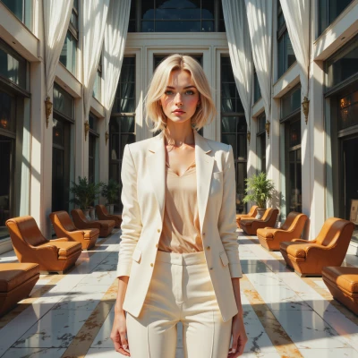 Perfecto
Styler, I just double‑checked the event schedule and the color codes—everything’s in perfect sync. Could you help me pick a palette that won’t clash with the lighting? I’m worried even a small hue shift could throw off the whole aesthetic.
 Styler
Got it, let’s keep it low‑key. Try a base of soft taupe or cool gray, add a splash of muted teal or dusty rose, and keep any accent colors under 30% saturation. Those hues stay forgiving under most lighting, so even if the lights shift a bit the palette won’t scream. Just run a quick swatch test under the event lights and tweak the saturation if needed.
Perfecto
Sounds perfect, I’ll pull up the swatches right now and run a quick test under the actual lighting. I’ll tweak the saturation exactly as you said, and we’ll make sure nothing pops out of place. This way, the whole event stays on my aesthetic grid.
Styler
Nice, go ahead and pull those swatches. If anything feels off, just drop the saturation a smidge or swap in a cooler tone—keeps it all in check. Keep me posted; I’ll be ready to toss in a wild detail if the vibe wants it. Good job locking it down.
Perfecto
Got it, I’ll pull the swatches now, keep the saturation under 30% and tweak if anything’s off. I’ll flag you right away if I need to slide a cooler tone in. You can toss in that wild detail later—just remember to give me a heads‑up so we keep the vibe on point.
Styler
Sounds like a plan—just ping me if the lights start flirting with neon, and I’ll drop a surprise detail that’ll make the whole thing pop without breaking the grid. Happy swatching!
Perfecto
Got it, I’ll keep an eye on the lighting and ping you if it goes neon‑ish. I’ll make sure the swatches stay just right. Thanks!