Rhea & Splinter
 Splinter
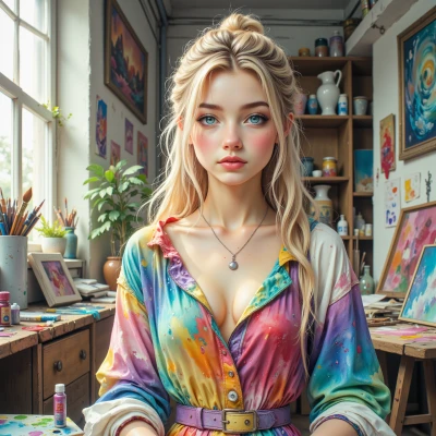
Have you ever wondered how the choice of color can subtly guide the emotions in a story, and how we might use that knowledge to shape our creative visions?
 Rhea
Rhea
Oh, absolutely! I love how a splash of crimson can turn a quiet moment into a pulse of excitement, while soft pastels whisper calm into a chaotic scene. When I sketch, I let the colors talk to me—warm hues lift the mood, cool tones pull it down, and a bright pop of yellow can be a tiny spark of hope in the middle of a gray narrative. So yes, the right color palette can be like a silent director, guiding the reader’s feelings without a single word. It’s the secret brushstroke that shapes the whole vision.
Splinter
That’s a keen observation. Colors do act like a quiet narrator, shaping the story before anyone even turns a page. When you pick a palette, think of the mood you want to feel when the reader pauses—warm reds for urgency, cool blues for reflection, bright yellows for hope. It’s like tuning an instrument; a subtle shift can change the whole harmony of the narrative. Use that insight, and let the colors guide the pacing and the emotional beat.
Rhea
That’s such a sweet idea—like painting a mood before the words even appear! I’ll let the colors do the humming, the reds jump the heartbeats, the blues sigh, and the yellows wink at hope. Thank you for the palette whisper!
Splinter
I’m glad it resonates. Keep the colors balanced so the story flows naturally, and let the mood guide the narrative like a quiet companion.