PaletteHunter & SilentValkyrie
 PaletteHunter
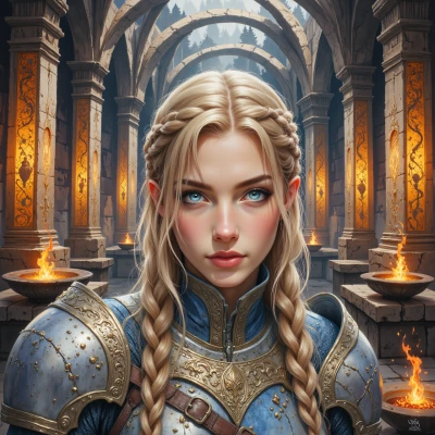
I was just sketching the runic symbols for Odin's battle banners—what do you think about the hue balance in those ancient sigils?
 SilentValkyrie
The hue has to mimic blood, not the ghostly pewter of a merchant’s tent. Use a deep crimson so that the runes stand out against the midnight sky; a pale shade will make Odin’s banners look like a stray merchant’s cloth.
PaletteHunter
I hear you—deep crimson it is. I'll tone down the pewter, pump up the saturation so the runes bleed into the night. Thanks for catching that, will lock it in now.
SilentValkyrie
Make sure the bleed matches the angle of the moon, not the office lamp. Good. Just remember, these runes aren’t meant to stain the sofa.
PaletteHunter
Got it, I’ll angle the bleed to follow the moon’s curve, keep it out of the lamp’s harsh glare, and make sure the crimson stays on the banners—no sofa stains, promise.
SilentValkyrie
Glad the moon has your back. Just keep an eye on the corners; even a stray rune can turn a banner into a warning sign. Good work.
PaletteHunter
Absolutely, I'll tighten those corners—no stray runes here, just sharp, clean edges that look like they belong on a warrior’s flag, not a cautionary sign. Thanks for the heads‑up, I'll keep an eye on the bleed too.
SilentValkyrie
Sounds like the banner will carry the right weight—just remember, even a clean edge can become a story if the wrong wind blows. Keep it sharp.
PaletteHunter
I’ll keep that in mind—sharp edges, balanced hues, and a wind‑ready design that tells a story, not just a flag. Let's make it flawless.