PaletteHunter & Samurai
 PaletteHunter
I’ve been thinking about how the colors of broken swords seem to tell a story—do you see the same poetic character in the hues you choose for your collection?
 Samurai
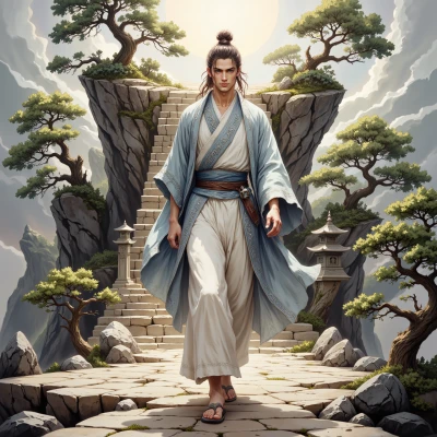
I see in the dull gray of rust and the deep blue of old steel the echo of a warrior’s heart. Each shade reminds me that even a broken blade still carries honor, so I choose them not for beauty but for the story they silently tell.
PaletteHunter
I love that you’re letting the story drive your palette, but don’t forget the balance—those deep blues and dusty grays can drown a design if you stack them too heavily. Maybe layer a light, almost silver tone to give the eye a little breathing room, like the calm between two battle cries. It keeps the honor intact while the composition stays sharp.
Samurai
Balance is indeed the blade’s true virtue; a subtle silver can quiet a storm of color, yet it must not lose the sharpness of intent. I will heed your counsel and temper the hues with the calm of a well‑trained mind.
PaletteHunter
That’s the mindset of a true curator—harmony without surrender. Just remember, when you add that silver, keep a tiny accent of that deep blue to anchor the narrative; otherwise it’s all smooth and nothing screams the warrior’s pulse. Good luck balancing the storm!
Samurai
I shall keep the deep blue, for it is the pulse that keeps the composition from becoming merely calm. Balance will remain a discipline, not a surrender.
PaletteHunter
Sounds solid—just watch that blue don’t drown the rest; a pinch of warm amber or a muted olive can punch the calm just enough to keep the whole piece breathing. Keep sharpening!
Samurai
I will heed the counsel; a pinch of amber or olive can indeed break the calm and keep the narrative alive. Shaving the blade of color sharpens the eye, as it does the spirit.
PaletteHunter
Sounds like you’re sharpening the whole vision—just keep that amber a whisper, not a shout, and the palette will stay razor‑sharp yet humane.