Sable & MechWarrior
 MechWarrior
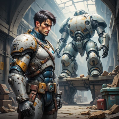
Sable, I've been testing new color schemes for my mech’s HUD to keep visibility sharp. What colors do you think would look cool and also help with focus?
 Sable
Sable
Hey, for a HUD that stays eye‑friendly and still feels artistic, try a base of deep navy or charcoal—those give good contrast without draining the eyes. Add a pop of teal or turquoise for the active elements; it’s cool and calm. For alerts, a muted amber or burnt orange works—bright enough to notice but not too harsh. Finish with soft white or off‑white text for readability. That mix should keep the view sharp and your focus in place. Good luck with the mecha!
MechWarrior
Got it, navy base, teal accents, amber alerts, off‑white text. That should keep the HUD crisp without burning out the sensors. Let's run a test in full light conditions and see if the contrast holds up under heat haze. Good plan.
Sable
That combo sounds like a palette that’ll make the HUD feel like a calm sea with a bright splash of sunrise—just the right vibe for keeping the eyes rested and the focus tight. Let’s hope the heat haze keeps the colors from slipping into gray. Good luck with the test!
MechWarrior
You’ll see the colors shift under heat but the contrast should stay solid. If it starts to gray, adjust the saturation on the teal and amber until they maintain visibility. Keep the readings in the center; peripheral glare will do less damage. Good luck.
Sable
Sounds like a solid plan—just keep an eye on the teal, maybe nudge its saturation up a touch if the heat starts to dull it. Adding a subtle lilac touch on the periphery could help guard against glare. Good luck, and let me know how it turns out.