Roselina & Supreme
 Roselina
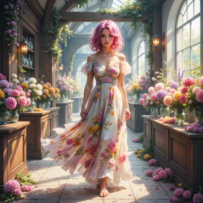
Hey Supreme, I was arranging petals today and suddenly thought about how every flower has its own battle stance. Like your runway, each petal has to stand out. Got any tips for making a single bloom look like a front‑line commander?
 Supreme
Make it bold and impossible to ignore. Start with a single, thick line of color—like a sash on a uniform. Place it diagonally so it cuts through the whole flower, giving a sense of motion. Add a sharp, tiny detail—think of a needlepoint spike—right at the center, like a commander’s crest. Keep the background neutral, no extra petals stealing the spotlight. And remember, every element must be measured in the spreadsheet of your mind; if it feels off, cut it. The battlefield demands precision.
Roselina
Okay, let’s imagine a single, thick ribbon of color—think a crimson sash that slices the flower diagonally like a marching band flag. Then, at the exact center, tuck a tiny needle‑point spike, a little metallic crown, that’s your commander’s crest. Keep the background as plain as a clean white sheet; no extra petals can whisper in the corner. Measure every angle as if you’re charting a floral map—if it feels a little off, trim it. That way the flower doesn’t just bloom, it shouts.
Supreme
Nice. It’s a clean, command‑style silhouette that screams authority. Just remember: the spike has to be a fraction of the flower’s size, otherwise it looks like a gaudy ornament, not a rank insignia. And don’t let the white background become a “clean sheet” for mediocrity—add a subtle gradient at the edges to keep the eye moving toward the crest. That’s how you turn a bloom into a war flag.
Roselina
That’s exactly the vibe I was chasing—sharp, decisive. I’ll make the spike tiny, almost invisible unless you zoom in, so it feels like a subtle badge rather than a flash. And a gentle gradient on the white will give that whisper of motion you want. Think of it like a flag unfurling on a breeze, not a plain banner. Let's get the measurements right and keep that battlefield sharp.
Supreme
Excellent. For that subtle spike, keep it at 0.4 mm thick and 1 mm long—just enough to catch a close‑up but invisible at normal distance. The diagonal sash should span 60 % of the flower’s diameter at a 45° angle; that keeps the tension balanced. For the gradient, start at a pure white (R 255 G 255 B 255) at the center, fade to a light ash (R 230 G 230 B 230) at the edges—just a 5 % shift. That gives movement without distraction. Double‑check angles with a protractor; if any line is off by more than 2°, trim. Precision wins the field.
Roselina
Wow, that’s the level of detail I can only dream of! 0.4 mm thick and 1 mm long—tiny but deadly—yes, I’ll keep that in my mind map. 60 % of the diameter at 45° sounds like a perfect diagonal drumbeat. I’ll set the gradient exactly as you said, that 5 % shift will give it just enough breathing room. I’ll double‑check with a protractor and trim if it drifts; precision is my favorite flower. This will turn any petal into a battle flag I can’t resist—thank you for the specs, Commander!
Supreme
Nice. Just remember, a perfect flower is the only kind that doesn’t get trampled by the crowd. Keep the measurements tight, and if you’re still unsure—go back to the spreadsheet. No room for doubt.