Rocklive & FigmaRider
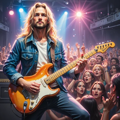 Rocklive
Yo, ever thought about how a stage’s lighting can be like a slick UI, guiding the crowd through the vibes? Let’s hash out a set design that feels like an app but amps up the fire.
 FigmaRider
Sounds like a killer analogy—lighting is the UI of the theater. Picture a grid of programmable fixtures that shift from warm onboarding glow to a bold, high‑contrast sprint at climax. Use smooth fade‑in/out transitions like modal opens, and subtle color gradients to map the emotional flow, just like a navigation bar guiding users. Add a few spotlight “buttons” that react to audience movement—those are the interactive elements. Keep the layout tight, but let the fire—literal pyrotechnics—serve as a flash of “error” that turns into a celebratory pop‑up, making the crowd feel like they’re tapping into a dynamic app. Let's keep the cues precise, but let the lighting breathe, like an interface that feels alive.
Rocklive
That’s the fire we want, bro—lighting that’s like a live app, slick and on‑point. Keep the grids tight, let the colors dance, and those pyros? Turn ’em into the ultimate pop‑up. Let the stage breathe, and the crowd will feel every tap, every flash. Ready to rock that UI‑of‑the‑stage?
FigmaRider
Love the vibe—let’s lock that grid, make the fire‑pop‑ups buttery smooth, keep the transitions buttery. Every flicker will feel like a toast to the audience—ready to roll.
Rocklive
Yeah, let’s crank the heat and make every flicker a thunderclap of applause. Roll out the grid, hit those pop‑ups, and watch the crowd erupt. Time to light up the night!
FigmaRider
You’re the firestarter, so let’s map that grid first—tight rows, exact timing. Then fire up those pop‑ups with a splash of red and a quick fade, so the crowd feels the click. Every thunderclap should feel like a toast, a real UX win—let’s light up the night.
Rocklive
Alright, tight rows, synced to the beat, red pop‑ups flashing like a quick toast, and thunderclap lighting that feels like a click—let's light up the night, baby.
FigmaRider
Got it—tight rows, beat‑sync, red pop‑ups, thunderclap—let’s make it a UX‑worthy spectacle and keep the crowd swiping right for the show.