RealBookNerd & Kraska
 Kraska
I love it when a book paints a whole scene with color—like when a character’s mood shifts because the sky turns that exact shade of violet. How do you feel about authors using color that way to show their characters’ inner life?
 RealBookNerd
I think it’s one of those subtle tricks that makes a page feel alive. When the author ties a hue to a mood, it lets you read between the lines without a heavy hand. But it also risks becoming a cliché if overused; the color has to feel earned, not just decorative. If it’s integrated—like a violet sky that mirrors a character’s uneasy reflection—it becomes a quiet, almost invisible cue that speaks louder than the prose itself. In my view, it’s a delicate balance: you want the palette to echo the inner life without turning the story into a literal painting.
Kraska
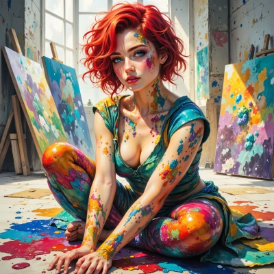
Yeah, I get it—you’re saying it’s like a secret palette for the reader, but if you overdo it, the whole thing feels flat, like a splash of paint that just says “look at me.” I’d say just because a hue is a cue doesn’t mean it’s a cliché. If the author really feels that color is the right way to show what’s going on inside a character, the page gets a second life. The trick is not to shout, but to whisper, and let the color do the heavy lifting. That’s what I do with my canvases—sometimes I paint a storm in blue and then the whole thing turns on the light. It’s all about that harmony.
RealBookNerd
I’m with you on the whispering side—when the color just folds into the narrative it can feel almost invisible, yet deeply resonant. It’s like an undercurrent you notice only when you pause. And just because it’s a cue doesn’t make it a cliché if it’s tied to something unique in the story. The real trick, I think, is balancing that subtlety with enough weight so the reader feels the shift without it being a blatant signpost. Your painting analogy fits: a storm of blue that only brightens when the light hits it—nice way to describe the effect.