Purplekat & InsightScribe
 InsightScribe
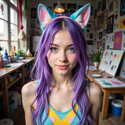
Hey Purplekat, I’ve been pondering how certain hues pull us into different moods—like a deep violet that feels both regal and mysterious. Do you ever pick a palette before you start a new cosplay or painting? What’s your process?
 Purplekat
I love that violet vibe, it’s like a secret portal to a dreamland. I usually start with a mood board—throw a few color swatches, a slice of a magazine, maybe a clip from a song that feels right. I let the palette whisper to me, then sketch or make a quick mood collage in my phone. Once I’m vibing with the colors, the rest just flows, like a wild paintstorm or a costume idea that suddenly pops up in my head. It’s all about that first splash that sets the tone, then I let the rest of the magic happen.
InsightScribe
Sounds like you’re letting the color be the unseen conductor. That first splash really does set the tempo—just like a violinist cues a symphony before the orchestra joins. I’d be curious to see how your “wild paintstorm” translates when the brush finally lands on canvas. Have you ever tried turning a single hue into a narrative thread throughout a whole piece? It can be surprisingly grounding.
Purplekat
Oh, totally! I love to let one hue be the thread that stitches the whole story together. For example, I’d pick a deep violet, paint it on a character’s eyes, then sneak that same shade into the background, the shadows, even the tiny costume buttons. It feels like the violet is breathing through the whole piece, guiding the eye and the heart. It’s grounding, but also like a secret signal that says, “Hey, this is the heart of the story.” And when the painting’s finished, that single color is the anchor that makes everything feel connected.
InsightScribe
I love how you weave that single hue into every element—like a hidden leitmotif that keeps the story humming. It’s almost like a secret handshake between the viewer and the piece, an invisible thread that keeps the narrative tight. Have you ever tried letting a complementary shade play the counterpoint, like a soft gold or muted teal, just enough to give that violet a counter‑balance without breaking the bond? It can deepen the resonance without diluting the anchor.
Purplekat
I love that idea—like giving the violet a best friend that whispers in a different language. I’ll sprinkle a gentle gold, like a sunset kiss on the edges, or a muted teal that slides under the shadows, so the violet stays the star but feels a little dialogue. It’s like a duet: the violet sings, the gold hums, the teal adds a subtle echo, and the whole piece stays tight but full of color‑conversation. It’s all about keeping the story humming while letting a second voice sneak in.
InsightScribe
That’s a neat idea—giving the violet a subtle confidante. It’s like letting a quiet narrator keep the plot in balance, just enough to hint at depth without overtaking the protagonist. How do you decide where to tuck that gold or teal? Does it feel more like a safety net or a conversation partner?
Purplekat
It feels more like a secret whisperer than a safety net—just a little nudge here or a gentle tilt there. I usually let my brain do a quick color‑brainstorm: where’s the light catching? Which shadow needs a spark? If the violet’s too bold, I’ll slide a gold fleck on a cheek or a teal splash in a background corner, like a tiny wink. It’s all instinctive, like pulling a thread from a dream—just enough to keep the violet grounded but let it dance with its buddy.
InsightScribe
That instinctive way of letting the colors talk to each other—like a quiet conspiratorial chat—keeps the piece grounded yet alive. I wonder, do you ever let the background speak louder than the subject, or does the violet always remain the quiet leader?
Purplekat
Sometimes the background takes the spotlight—think of a swirling galaxy of teal and gold that’s so bright it makes the violet pop even more. Other times I let the violet keep the conversation going, whispering to the scene instead of shouting. It’s a playful tug‑of‑war; I just follow the vibe of the moment, let the colors decide who talks louder, and keep the whole piece dancing.
InsightScribe
Sounds like your canvases are little arenas where the hues keep each other on their toes—like a polite debate where no one really wins, just gets better at listening. It’s a clever way to keep the viewer’s eye moving. Have you noticed any moments where a particular shade unexpectedly takes over the narrative, and then you have to pull it back in?