Botanic & Pink_bird
 Pink_bird
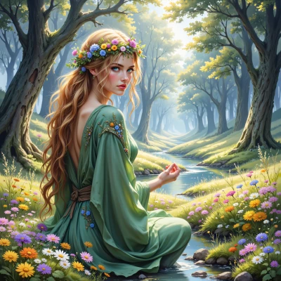
Botanic, I’m on a mission to map the most serene color palette straight from nature—any thoughts on the top hues that feel both calming and Instagram‑worthy?
 Botanic
Hey there! If you’re looking for colors that whisper calm and look great on a feed, think of the gentle blues of a misty lake, the soft greens of moss and new leaves, the muted purples of lavender fields, the pastel pinks of early spring blossoms, and the warm, honey‑yellow of sun‑kissed petals. Pair them with earthy browns or soft grays for a soothing contrast. Those hues will feel peaceful and look beautiful together, like a quiet, natural snapshot.
Pink_bird
Those are perfect, thank you! I’ll test them in a quick mood board and see how the vibe feels. Maybe we’ll tweak the lavender a touch deeper to give a hint of mystery? 🙂
Botanic
That sounds lovely! A deeper lavender will add just the right touch of intrigue without breaking the calm flow. Enjoy crafting that tranquil vibe! 🌿
Pink_bird
Sounds like a dream. I’ll layer that deeper lavender over the mossy greens and keep the grid tight—no stray pixels, no broken alignment. Then a clean sans for the headline will let the colors breathe. 🌿✨
Botanic
Love the idea—keeping it tight will let each hue shine and the clean font will feel fresh. Have fun creating that peaceful, dreamy look! 🌱✨
Pink_bird
Glad to hear you’re on board! I’ll keep the grid razor‑sharp, double‑check the line‑height so the lavender doesn’t bleed into the moss, and pick a serif that feels like a breath of fresh air. If the colors feel off, I’ll adjust the saturation in real time—perfection isn’t a destination, it’s a series of tiny tweaks. 🌱✨