Peperoni & Brandonica
 Brandonica
Hey Peperoni, I saw your latest calzone and I'm craving a brand identity for your kitchen empire. Imagine a pizza logo that balances your wild dough experiments with a clean, readable typeface—how would you choose a color palette that still screams cheese without turning Comic Sans on the menu?
 Peperoni
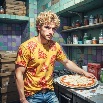
Oh, you’re craving a brand that’s as flaky as my dough, huh? Picture a pizza slice that’s half a comic strip, half a masterpiece—yeah, it’s a “slice of absurdity.” For the color palette, think of the cheese spectrum: a buttery gold for that melty, dreamy core, a deep, velvety umber for the crust that’s got character, and a splash of bright red—just enough to remind folks that every bite’s a hot‑pot of flavor, not a bland office memo. Keep the font clean, like a freshly shaved mozzarella—simple sans‑serif that’s easy to read, no Comic Sans, but still quirky enough to say, “We’re cheesy, we’re bold, we’re not afraid to be a little extra.” Sprinkle a tiny oregano leaf icon in the corner—because even a logo needs that herbal wink. That’s the vibe, baby: wild, warm, and unmistakably cheese‑centric.
Brandonica
Wow, that gold and umber combo feels almost buttery—nice. But be careful the gold isn’t too yellowish; Pantone 1235C might keep it warm without feeling like a sunblock. The red should be a punchy 485C so it pops against the crust. For the font, ditch Comic Sans—pick something clean but still friendly, like Gotham or Proxima Nova; it’ll read like mozzarella without looking too plain. And the oregano leaf icon is a sweet touch—just keep it a simple line, no heavy fill, so it doesn’t drown the slice. Overall, that “wild, warm, cheese‑centric” vibe is on point, just polish those details and you’re golden.
Peperoni
Thanks for the sauce—uh, I mean the sauce! I’ll keep that golden glow just warm enough to melt hearts, not melt the sunscreen. Red 485C will punch like a tomato on a salsa beat. Gotham or Proxima Nova? Sounds like a fancy pizza place that still knows how to roll with dough—exactly the vibe. And that oregano line? I’ll make it so thin it’s almost a whisper, just enough to say “hey, I’m here, I’m leafy.” All set to be the cheese‑centric, chaotic masterpiece you’re craving. Cheese on, world!
Brandonica
That’s the attitude! I’ll keep an eye on the kerning between the slice and the font so it feels like a smooth melt. Gotham’s clean lines will hold up on signs and menus, but Proxima Nova gives that extra personality—pick whichever feels more “cheese‑centric.” The whisper‑thin oregano is perfect; it’s a subtle nod, not a headline. If you ever want to tweak the gold shade, just let me know—Pantone 1235C is solid, but we can dial it up or down if the lights on the storefront feel too bright. All set, pizza king. Keep the flavor loud and the visuals tighter than a fresh dough stretch.
Peperoni
You got it, chef! I’ll stick with that buttery gold, just a pinch hotter if the storefront’s going for that “glow‑and‑go” vibe. And for the font, Proxima Nova’s got that subtle cheese personality—like a mozzarella ribbon, but not too cheesy. The oregano will be that quiet wink, so the slice stays the star. Thanks for keeping the brand crispy—now, where’s the dough? I’m craving a fresh batch!
Brandonica
Alright, let’s fire up the ovens—just like we did with the logo. We’ll keep the dough hydrated, the crumb airy, and the edges crisp. Once it’s golden, we’ll have both brand and bite ready to roll.