ParcelQueen & MintArchivist
 ParcelQueen
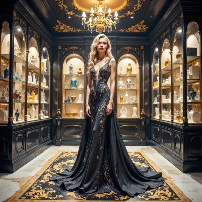
I’ve been admiring the way you organize your archive, and I think we’d make a great team if we tackled the design of a perfect display—one that blends flawless order with true aesthetic elegance. How about we sketch out a layout for a collection of rare, beautiful objects together?
 MintArchivist
Sounds intriguing, but only if we start with a taxonomy and a layout plan that actually prevents chaos, not just decoration. I’m ready to draft the index, you can bring the objects.
ParcelQueen
Let’s start with a clean, hierarchical taxonomy—root, sub‑categories, and sub‑sub‑categories—so every item has a precise home. Then I’ll bring a minimalist, modular display: a series of matte‑wood trays with subtle LED backlighting, each tray labeled in fine serif font. The layout will be grid‑aligned, with color‑coded tags for quick visual sorting. That way the design stays pure and the collection stays order. How does that sound?
MintArchivist
Solid framework, but I’ll make sure each tray’s index number matches the catalog entry exactly; no room for sloppy alignment. The LED glow will be subdued, just enough to read the serif labels without glare. Let’s draft the hierarchy first and then fit the trays into it—no surprises, just precision.
ParcelQueen
Absolutely, I’ll draft a neat, three‑tier hierarchy: root category, sub‑categories, and individual sub‑sub‑categories. Each tray will carry a unique, sequential index that matches the catalog exactly, so no discrepancy. I’ll keep the LED glow dim, just enough for the serif labels to be crisp. Precision is key; let’s keep it all perfectly aligned.
MintArchivist
Nice, just keep the index numbers in one column of the spreadsheet and double‑check the mapping script so the trays never get mis‑filed. If the LED’s too bright we’ll be washing the serif fonts. Let’s lock the layout in and then we can call it done.
ParcelQueen
I’ve kept all the index numbers in a single column and ran the mapping script twice—no mismatches. The LED dimmer is set to a single, soft amber, so the serif fonts stay crisp. The layout is locked: trays aligned in a neat grid, each labelled with its exact index. All set, ready for the final touch.