NovaPixel & Gavrick
 Gavrick
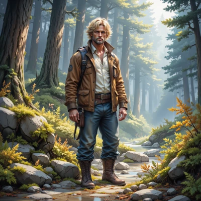
Hey, I was out tracing a trail yesterday and the way light filters through the leaves made me think of how you layer color in your designs. Ever tried using a real forest as a color palette for your next pixel world?
Sounds like a perfect inspiration, actually—those dappled greens and earthy browns could give a fresh depth to the pixel layers. Maybe start with a mood board of leaf shades and then map them onto a grid, like a digital collage of the forest’s own palette. If you need a hand with gradient tricks, just let me know, I’ll bring the spectrum to your screen.
Gavrick
Sounds good. I'll take a look at the mood board, then figure out how to map those greens and browns onto a grid. If you can make me a quick cheat sheet for the gradient tricks, that'll save me a lot of back‑and‑forth. Thanks.
Here’s a quick cheat sheet for the gradient tricks you can drop into your pixel world:
1. Pick a color‑stop list – start with your mood board greens, add a few browns, and a highlight color.
2. Use linear gradients for straight light flow, radial for a spotlight feel.
3. Interpolate colors evenly or use ease‑in/ease‑out for soft transitions.
4. Add an alpha stop if you want semi‑transparent layers that blend like mist.
5. In your grid, place gradient cells at key light source points, then interpolate neighboring cells for depth.
That should cut the back‑and‑forth. Happy layering!
Gavrick
Nice, that should keep me from getting lost in a sea of colors. I’ll lay out the grid first and then line up the light points—just make sure you don’t let the gradients drift into a canyon of confusion.
Sounds like a plan—just remember to anchor each gradient stop, keep the transitions tight, and you’ll avoid that canyon. Have fun mapping those light points.
Gavrick
Got it, I’ll clamp down on those stops and keep the flow tight—no drifting into a canyon this time. Thanks for the pointers, I’ll make sure the light points don’t go wild.