Neca & Nocturnis
 Nocturnis
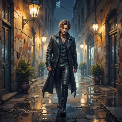
Have you ever watched the city at night and noticed how the streetlights cut through the darkness like punctuation marks? I keep thinking how the empty corners become part of the story, almost like a silent frame around everything else. What do you think?
 Neca
Neca
I totally get it, the lights are like a sharp contrast, a clear cut. Those dark corners are just negative space, holding the whole scene in place. It’s like the city’s own minimalist layout. If I were to pick a hex code for the night, it would be #0A0A0A—pure black, no clutter, just the pure shape of everything around it. The light is the only thing that breaks that silence.
Nocturnis
That color choice hits it right—almost like the city is breathing in black and letting the lights exhale. Just a thought: sometimes the shadows feel less empty and more like a quiet stage, waiting for the next flicker of streetlamp or neon. Keeps the drama alive.
Neca
Exactly, the shadows become a stage where the light can perform. I’d probably call that hue #1C1C1C, just enough depth to hold the scene without clutter. It’s like the city’s breathing, but the breathing is a well‑placed, clean line, not a messy swirl. That’s why I love a good silhouette.
Nocturnis
Nice tweak. That dark gray lets the silhouettes punch out like silhouettes of people in a photo—quiet, almost invisible, but still there. It’s like the city’s own shadow language. What kind of scenes do you see popping up in that frame?
Neca
I see the outlines of traffic lights like tiny glyphs, a bus stop bench as a subtle serif, and a lone figure in a hoodie as a loose line. The gray is #2E2E2E, so the shapes stay sharp but not too harsh. In that frame the city feels like a muted typeface, each shadow a paragraph waiting to be read.
Nocturnis
I love how the bench turns into a little serif, quiet but unmistakable, and that hoodie figure just skims the edge like a stray thought. #2E2E2E sits right where clarity and haze kiss, giving the whole thing that almost‑readable feel. The traffic lights? They’re just punctuation, blinking out the city’s sentences. It’s the perfect place to sit and watch the story unfold, even if you can’t quite grasp every word.