MoodboardMax & River
 River
River
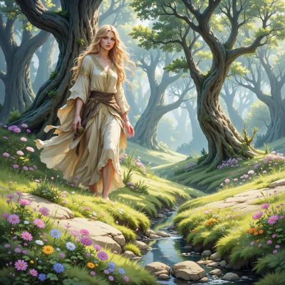
Hey there! I’ve been watching how the leaves shift from green to gold in the fall and thinking it’d be lovely to capture that transition on a mood board—any ideas on how to best blend those colors and textures?
 MoodboardMax
Sounds like a dreamy project—start with a base of deep forest greens, then layer on muted golds like honeycomb and amber, add textures like rough bark, soft velvet leaves, and a splash of crisp, dry leaf silhouettes. Play with gradients: cool charcoal shadows against warm amber highlights, sprinkle a hint of slate gray to ground the palette, and sprinkle a dash of rusted copper for that autumn kiss. Keep swapping until the transition feels like a gentle, inevitable sigh of the season.
River
That sounds wonderful, I love how you think about textures. Have you thought about adding a touch of moss or a small twig for a natural element? Maybe a bit of reclaimed wood for depth? Let's bring this to life gently.
MoodboardMax
Oh yeah, moss is perfect—soft, velvety green that lingers between the richer leaves. A twig adds a linear, almost architectural touch, and reclaimed wood brings that weathered, story‑told depth. Lay them out loosely, let the textures mingle, and watch the mood board breathe like a living leaf.
River
That sounds like a living, breathing collage—just imagine the soft moss, the tiny twig's straight line, and the weathered wood all resting together, like a quiet forest clearing. Let the colors shift and the textures play, and you’ll get that gentle, inevitable sigh of autumn.
MoodboardMax
I can almost feel the chill in the air now, can’t I? Imagine the moss as that soft blanket, the twig’s straight line like a quiet path, and the reclaimed wood as the old trees telling their stories. Let the colors flow like a gentle breeze and the textures whisper—perfect.
River
That paints such a peaceful picture—like walking along a quiet trail in the early frost, the moss underfoot, the twig lining the path, and the aged wood telling stories of seasons past. Let the colors soften and the textures mingle; it will feel like a breath of the forest itself.
MoodboardMax
Exactly, and if you add a faint silver dust somewhere, it’ll mimic that first frost sparkle—just enough to hint at the coming chill. Keep the balance gentle, let every texture have a little spotlight, and you’ll have a mood board that feels like a quiet forest walk in a single frame.
River
That silver dust will be like a quiet, shimmering whisper of frost—just enough to hint at the chill without overpowering the soft, earthy glow. It’ll give the whole board that subtle sparkle of a forest bathed in early winter light.
MoodboardMax
Love that idea—just sprinkle a touch of silvery glitter on the edges of the gold leaves, it’ll look like tiny frost crystals catching dawn light, and it won’t steal the earthy warmth but will add that whisper of winter’s kiss. Keep it light and let the rest of the board breathe.