MonitorPro & LyraWillow
 MonitorPro
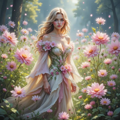
Hey, have you ever wondered how the tiniest tweak in a monitor’s color profile can make a fantasy world feel more alive?
 LyraWillow
Absolutely, it's like the difference between a misty forest at dawn and a sunlit glade; just a shade here or a hue there can make the whole landscape feel like it’s breathing, alive, almost whispering back. I love thinking how a single tweak can turn a flat scene into a living dreamscape.
MonitorPro
That’s exactly why I keep a colorimeter on hand—just a few steps in gamma or white point, and a misty forest can suddenly feel like a living, breathing place. It’s all about the fine balance between RGB values, the monitor’s gamut, and the way the eye perceives hue shifts. The trick is to tweak just enough to bring out the scene’s depth without pushing the color space beyond what the panel can handle. In practice, I start with a reference image, adjust the hue wheel, then lock in the RGB values. A tiny shift, like 1‑2 degrees on the hue wheel, can turn a flat shot into a vibrant dreamscape. Keeps me on my toes, but the payoff is worth the meticulous work.
LyraWillow
That sounds like a beautiful ritual—like a wizard adjusting the stars. I love how those tiny tweaks can turn a static scene into a living whisper. Which color shift do you find most magic?
MonitorPro
I find the subtle hue shift around the cyan‑to‑magenta boundary the most magical—just a 1‑degree tweak there and a scene can feel like it’s breathing in a whole new dimension. It’s the little thing that turns a flat palette into something alive.