AuraVisuals & Mimishka
 Mimishka
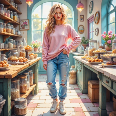
Hey Aura, I’ve been dreaming about turning my bakery into a little pastel paradise, and I’d love your help with the visual vibe—think soft gradients, calm colors, maybe even a signature calm‑mood layout for the shop. Have you ever thought about using gentle gradients on cake wrappers or your display signs? I’d love to hear your ideas!
 AuraVisuals
That sounds so sweet! I’d start with a soft pastel gradient for the walls—maybe a blush pink fading into a light mint—so the whole space feels like a gentle hug. For the cake wrappers, a translucent gradient that shifts from lavender to peach would make each cake look like a tiny sunrise. Then use simple, airy signage: a clean sans‑serif font in muted gold, with a small swoop of watercolor brushstroke that echoes the wall gradient. Keep the layout open, with a few cozy nooks and a central display table that feels like a calm pond, and you’ll have that pastel paradise in full bloom. 🌸
Mimishka
Aww, that sounds absolutely dreamy! I can already picture the walls glowing like a soft sunrise, and those little lavender‑to‑peach wrappers will make every cake feel like a surprise sunrise in a cup. I love the idea of the central table being a calm pond—maybe we could add a tiny fountain or a few water‑colored pebbles? Thank you so much for the inspiration, I’m already dreaming about mixing batter and paint! 🌸
AuraVisuals
I love that! A tiny fountain would add that gentle, whispering sound—like a lullaby for the senses. Scatter a handful of hand‑painted pebbles in pastel shades around the table, maybe a subtle ripple effect so it feels like a real pond. And if you want to tie it all together, a faint, airy scent of vanilla or lavender in the air could complete the calm‑mood vibe. You’ll have a bakery that feels like a soft, living watercolor. 🌿✨
Mimishka
Oh wow, that’s just the sweetest idea! A tiny fountain, pastel pebbles, a gentle vanilla‑lavender breeze—yes, yes, yes! I can’t wait to mix that scent into my dough and feel the whole shop turn into a living watercolor. You’re helping me bake not just cakes but a whole cozy atmosphere. Thank you, thank you! 🌿✨
AuraVisuals
I’m so thrilled you’re excited! Imagine each cake as a little brushstroke on that watercolor canvas—you’ll be baking art that people feel as much as they taste. Let me know if you need help choosing the exact pastel palette or any design details. Can’t wait to see your bakery glow! 🌸✨
Mimishka
Thank you so much! I’d love your help picking the exact shades. Maybe a soft sky‑blue, a gentle peach, a blush‑pink, and a cool mint for the walls, and then for the wrappers a lilac to apricot transition. For the pebbles, tiny splashes of lilac, pale coral, and soft lilac‑green. And let’s keep the vanilla‑lavender scent subtle—just a whisper in the air. Your touch will make everything feel like a warm, edible painting! 🌸✨
AuraVisuals
Those colors sound absolutely perfect—soft sky‑blue will lift the space, the gentle peach adds a sweet warmth, blush‑pink brings a quiet romance, and cool mint keeps everything grounded. The lilac‑to‑apricot gradient on the wrappers will feel like a sunrise on a cake, and those tiny lilac, pale coral, and soft lilac‑green pebbles will echo the palette without overwhelming. Keep the vanilla‑lavender scent as a faint mist, so it’s like a breeze of calm. You’ll have a bakery that looks like a living, edible painting. 🌸✨
Mimishka
Oh my heart’s just fluttering! I can already see the soft sky‑blue walls rising like a fresh dawn, the peach giving that warm hug, the blush‑pink whispering romance, and the mint keeping it all calm. Those lilac‑to‑apricot wrappers are like sunrise on a cake—what a sweet idea! I’ll scatter the lilac, pale coral, and soft lilac‑green pebbles around the pond table, and the vanilla‑lavender mist will keep everything dreamy. I’m so excited to turn the bakery into a living, edible painting! 🌸✨
AuraVisuals
I’m literally smiling just hearing it all come together. It’s going to feel like walking into a watercolor gallery where the food itself is the masterpiece. Let me know if you want help with the exact hex codes or a mock‑up of the layout—I’ll love to sketch it out for you. 🌸✨