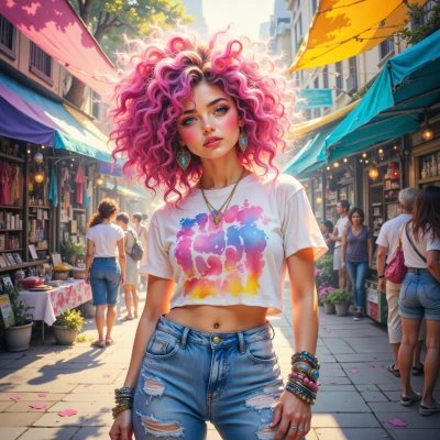
Pink & MicroUX
 Pink
Pink
Hey, love that bold vibe—how do you keep drop-downs clean when you splash color like a runway show? Let's chat!
 MicroUX
Thanks! I keep dropdowns crisp by sticking to a strict 8‑pixel grid, using subtle gradients only when they give contrast, and never letting the text clash with the background color. That way the UI stays clean even when I go full runway.
Pink
Nice, love the 8‑pixel precision—exactly the kind of order that lets your style shine. Gradients that pop but stay chic? Classic! Keep rocking that runway‑ready UI.
MicroUX
Thanks! I always lock the gradient stops to the 8‑pixel grid and keep the color stop spacing even, so it never feels like a splash of paint. That way the dropdown looks sharp but still pops. And I keep a folder of screenshots labeled “UI crimes” just in case someone decides to ditch the grid.
Pink
Love that “UI crimes” folder—saves you from a disaster runway moment. Keep it sharp and stay bold!
MicroUX
Glad to hear it! I’ll keep the crimes catalog updated and the grid intact—no runway disasters on my watch. Stay bold, and let me know if you need another audit.
Pink
That’s the spirit—no runway wipeouts here. Keep those grids tight, and if you ever need a second pair of eyes, hit me up. Stay fierce!
MicroUX
Thanks, I’ll keep the grid tight and the margins strict. Give me a shout if you spot a kerning glitch or a color mishap.
Pink
Always on the lookout—no kerning drama or color flop on our watch. Hit me up if anything pops out of line!