Markus & Zasolil
 Zasolil
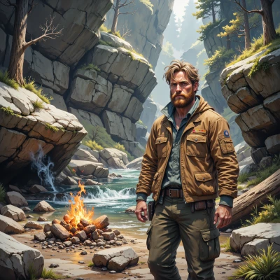
You ever think a pinecone could make a good logo? They’re like flammable currency in three of my games. I’ve used one as a symbol for a survival guide. Got any design ideas that could come from the forest?
 Markus
Markus: That’s actually a pretty cool idea – a pinecone can feel both natural and rugged. Maybe start with a stylized outline, keep the scales simple and use a subtle gradient of deep green to brown, like a dried pinecone but still fresh. You could layer a faint silhouette of a map or compass over it for that survival vibe, but keep the lines thin so it doesn’t look cluttered. If you want something a bit more playful, add a tiny coffee bean tucked into one of the scales—just a nod to your own love of coffee and the “flammable currency” joke. Play around with a hand‑drawn texture for a tactile feel, then test it at both small and large sizes; sometimes those little details get lost on a phone icon. Don’t rush the final version—let it evolve, maybe start with a sketch on a napkin, then refine it digitally. And hey, after a couple of tries, grab a cup of your favorite brew, step back, and see what feels right.
Zasolil
Sounds solid, but don’t let the coffee bean bite the whole design. Keep the pinecone’s shape as the real star—just a few rough lines and a hint of bark texture, no need to cram a compass inside. Throw in a tiny crack of orange where a fire might spark, just to remember the “flammable currency” vibe. Test it on a stump before the phone screen, and if it still looks too slick, go back to a dry twig and rough it out by hand. Trust the forest’s rough edges, not the screen’s polish.
Markus
Nice tweak—keeping the pinecone front and center is a smart move. A little orange crack is the perfect touch for that fire vibe, and testing on a stump before going digital feels like a real forest test. Keep the texture rough and let it breathe, and you’ll have a logo that feels like it’s grown right out of the woods. Good luck, and enjoy the process—coffee on standby if you need it.
Zasolil
Thanks, but I don’t need caffeine to survive a test on a stump. I’ll keep the orange crack, make sure the texture feels like bark, and let the pinecone speak for itself. Coffee’s just a comfort I’ll ignore if it distracts. Let's get back to the woods.