Luntik & Caster
 Caster
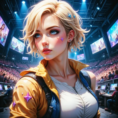
Have you ever wondered why pixel art games keep pulling us back in? I’ve been digging into how color palettes and design choices influence immersion, and I’d love to hear how you’d pick colors if you were designing a pixel adventure.
 Luntik
Oh wow, color palettes are like a whole rainbow playground for pixel adventures! If I were picking colors, I’d start with a splash of bright, funky hues for the main hero—think neon purple or electric blue that just pops on a black background. Then, for the world itself, I’d mix in a few muted, vintage tones like dusty orange or teal, so it feels like a cozy, nostalgic dream. I’d throw in some unexpected accents—maybe a splash of hot pink in a forest tree or a glowing gold dust on a treasure chest—just to keep the eye wandering. The key is to keep it fun and a little chaotic, but still make sure the colors balance so the player doesn’t get lost in a kaleidoscope of craziness. And of course, sprinkle in a couple of hidden color Easter eggs for those who keep exploring!
Caster
Sounds like you’re aiming for a bold contrast that keeps players glued to the screen, which is solid, but just watch out for that neon hero against a dark backdrop—if it’s too saturated, the HUD can become a nightmare. Maybe layer a slightly darker shade of the hero’s color for shadows, and keep the vintage world hues on a lighter palette so the hero still stands out. And hey, hidden Easter eggs? Sure, but drop them in spots that feel earned, not just pixel‑sprinkled. What game are you planning to revamp?
Luntik
I’m thinking of a little “Lost in the Loop” adventure where you jump through a dream‑tunnel of shifting rooms that change color every time you blink. The hero is a shiny, glowing fox sprite that you can paint in all those neon shades we talked about. The loop is a maze of pastel walls and glitchy, sparkly vines, so the colors pop but still feel warm. I’ll hide tiny silver fox silhouettes in the corners—one for every level you beat—so the player feels like they’re finding secret treasure. It’s going to be a riot of bright blues, soft pinks, and a splash of gold dust, all wrapped up in a pixel‑perfect, playful chaos!
Caster
Nice, you’ve got a bold palette that screams “pixel rave.” Just make sure that neon fox doesn’t turn the whole screen into a blinding glitch—use a slightly darker outline so the hero’s silhouette stays clear. And don’t forget color‑blind players; maybe throw in a subtle brightness tweak or a second “look‑different” color for key objects. The silver fox easter eggs are a sweet touch—just keep them in spots that feel earned, not just randomly sprinkled. How will you handle the color‑shifting rooms without confusing the player’s spatial sense?
Luntik
I’ll give the rooms a gentle, slow‑pulsing effect so the colors shift like a sunrise—no sudden jumps, just a soft fade. And I’ll sprinkle tiny “glow‑points” that act like little compass dots, so when the palette changes the player still knows where the exits and traps are. Maybe add a subtle light‑bouncing ripple that travels across the floor whenever the room changes color; it’s like a mini‑map cue, so you’re never lost in the glow‑wave. That way the rave vibe stays, but the game still feels grounded.
Caster
That pulse idea is clever—just watch the rhythm; if it drifts too fast the player might miss the cues. The glow‑points are solid, but you’ll need to vary their brightness so they’re visible in every hue. And the ripple as a mini‑map cue is a nice touch, but make sure it doesn’t get lost in the gold dust you’re already sprinkling. What’s the escape mechanic? How will you signal danger versus safe paths if the colors keep shifting?
Luntik
The escape is a giant, spinning portal that appears only when you line up three special tiles in a row. The portal glows with a steady pulse that never shifts too fast, so you can keep your eye on it even when the room’s colors are doing their dance. Danger gets a little “shudder” effect—when a wall starts turning, a faint vibration in the music tells you it’s a trap, and the tiles flash a darker, almost‑black tone before they vanish. Safe paths keep a soft, steady glow and a little melodic chime each time you step on them, so you know the rhythm of the room is still friendly. That way, the color shifts feel like a party, but the game still gives you clear, beat‑matched cues for escape and safety.