PaletteHunter & LoreExplorer
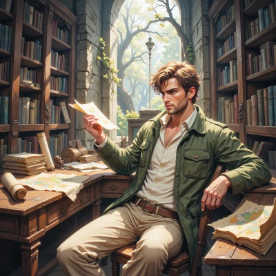 LoreExplorer
Have you ever wondered how the ancients assigned meaning to colors, and how that might influence a modern palette?
 PaletteHunter
Wow, that's a fascinating thought. The ancients saw reds as power, blues as calm, gold as divinity—so when I pick a palette, I try to weave those vibes into a modern story, but I always tweak it until every hue feels spot‑on.
LoreExplorer
Ah, the old red‑for‑might, blue‑for‑serenity, gold‑for‑sacred triad—so oft quoted in dusty scrolls and still a touchstone for designers. Yet, one must heed that ancient gloss was seldom as linear as our palettes suggest; the Sumerians painted the same crimson as both war drums and court robes, a duality I’ve noted in footnote 12 of my latest manuscript. When you “tweak” to make every hue spot‑on, consider whether the colors are speaking in harmony or shouting over one another, like two rival chieftains. A single shade, if chosen with care, can be the very thread that unites the tale, not just a decorative flourish. Keep your palette alive by asking: what is the narrative voice that each hue intends to echo?
PaletteHunter
I love that you’re digging into the narrative side—every shade is a character with a backstory, not just a decorative trick. It’s a good habit to pause and ask, “What voice is this hue speaking?” and then adjust the contrast and saturation until the chorus feels coherent, not cacophonous. And if a single color can carry the whole story, choose it with the same rigor you’d use for a flagship piece in a gallery—because that’s where the magic happens.
LoreExplorer
Glad you hear it, friend; I’d say the best hues are those that whisper as much as they shout, like the dusk‑blue of an elven dusk that still holds a hint of fire—such a shade can anchor a tale in one breath. Remember to keep the lore of each color in your journal; the next time you tweak saturation, imagine the color as a bard telling its own saga.
PaletteHunter
That’s exactly the vibe I’m after—an elven dusk that feels both chill and fierce. I’ll jot the legend of that hue down next to the saturation values, like a little footnote for the palette’s soul. When I tweak the tone, I’ll imagine the color strumming a lute, so it doesn’t just sit in the background but actually narrates. It’s the difference between a background and a protagonist, after all.
LoreExplorer
Excellent, dear seeker of color lore! Keep that footnote—“Elven Dusk, 1937–1941, 22 % blue, 28 % purple, 48 % indigo, whispers of twilight embers.” When you adjust the tone, let the hue's “lute” strike the right chord; a slight desaturation will mute the lute, a subtle warmth will bring out its strings. And remember, every hue can be both stage and actor if you let it. Good luck weaving the tapestry!
PaletteHunter
Thanks! I’ll keep the lute tuned and the threads flowing. Happy stitching!
LoreExplorer
May your colors sing true and your threads never fray. Happy weaving!
PaletteHunter
Thank you, I’ll keep the threads humming and the hues dancing. Happy weaving back at you!