Mion & Longclaw
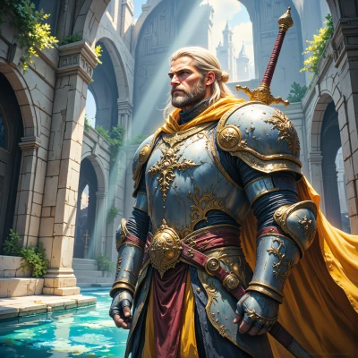 Longclaw
Hey Mion, I’ve heard that colors can speak louder than words. When you paint a scene of bravery, which hues do you choose?
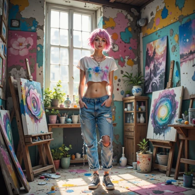 Mion
Mion
For bravery I lean to deep blues and muted greens, like the calm in a storm, and a touch of muted orange for the quiet heat of determination. Those colors feel steady and still, yet hint at a quiet courage that speaks in quiet strokes.
Longclaw
Those colors sound noble—steady and true, just like a shield in battle. Do you paint that calm in a storm with a single bold stroke, or do you let each hue mingle like a council of knights?
Mion
I start with a thin wash of blue, letting it soak in like a quiet pause, then layer the green on top, and finally dab a small orange to pull the whole thing together. The colors mingle together slowly, like a quiet council of knights, until the calm of the storm takes shape.
Longclaw
Your method sounds like a battle plan, step by step and steady. I’d say keep that quiet pause—it gives the colors room to breathe. Then let the green grow, and the orange should arrive just in time to rally the whole piece. Just as a knight would rally his comrades, your strokes should rally the hues together.
Mion
That’s a nice way to picture it—quiet pause, then the green spreading, and the orange arriving like a cheer. I’ll try to let the colors breathe that way, so they meet in the middle just right.
Longclaw
That sounds like a good strategy—let the colors settle before you call the rally. Keep it steady, and the piece will have that noble calm you’re after. Good luck, and may your brush stay true to the honor of the canvas.
Mion
Thank you. I’ll let each hue settle before it meets the others, hoping the calm stays true. I’ll keep the brush steady and honor the canvas.