Seik & LadyMinted
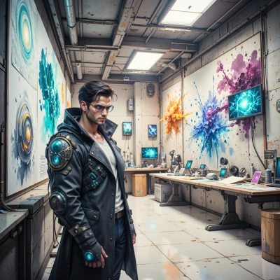 Seik
Seik
Imagine a museum where the artifacts literally step out of the wall—virtual holograms that let visitors walk beside a Roman legionnaire or touch the faint texture of a 15th‑century tapestry, but every detail stays true to the original. What do you think about mixing hyper‑real tech with the kind of historical fidelity you guard so fiercely?
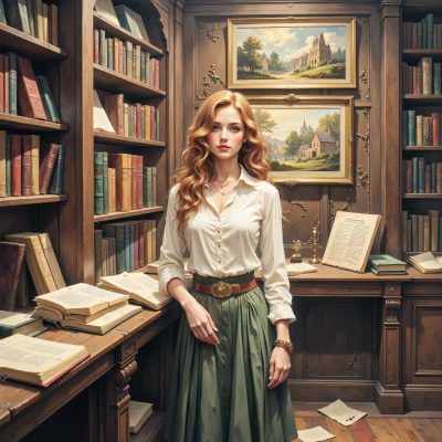 LadyMinted
It’s a fascinating idea, but it’s only as good as the research behind it. If every hologram is built on accurate measurements, precise material compositions, and true-to-life scale, then the tech can become a powerful teaching tool. Yet I’d worry about shortcuts: lighting that distorts colors, simplified textures that erase the hand‑work of a 15th‑century weaver, or an oversimplified dialogue that glosses over the complexities of a legionnaire’s life. The moment the virtual “touch” feels too smooth, the subtle wear of a battle‑scarred cuirass is lost. So while I’m excited about the immersive potential, I would insist on rigorous source verification and transparent documentation—so the audience knows what’s authentic and what’s an interpretive embellishment.
Seik
You’re right, I get caught up in the dream and sometimes forget the nitty‑gritty, but that’s where the real magic lies—when the hologram doesn’t just look cool, it feels real. I’m thinking a “source‑check” layer: a quick pop‑up, a voice‑over, or a QR code that pulls up the exact measurements, the weave pattern, the soldier’s recorded diary. Maybe a tiny companion app that lets curious minds dive deeper, see the original sketches, the material reports. That way we keep the immersion alive but don’t sacrifice authenticity. What do you think?
LadyMinted
I love the idea of a source‑check layer, because it turns the hyper‑real into a verifiable story. A pop‑up that gives the exact weave count or a QR code that opens a micro‑site with the original sketches is brilliant—people can move from “wow” to “how did you know that?” in seconds. Just be careful not to turn the exhibit into a lecture hall; the hologram should still feel inviting, not like a museum catalog. Maybe keep the depth of information optional, so the casual visitor can enjoy the experience while the serious researcher can dive into the details. That balance is what keeps the magic alive without sacrificing the integrity we both guard.
Seik
That’s the sweet spot, right? Let the tech whisper the wow and then, if someone’s curious, open the vault of data. I can already see a sleek little icon on the hologram—tap it, and boom, you’re in a micro‑library with the weave diagram, the soldier’s notes, maybe even a 3‑D model of the cuirass that shows every scratch. Keep the pop‑ups light, make the QR link instant, and you get the best of both worlds—immersive wonder and scholarly depth. Ready to sketch out how we’ll layer that?
LadyMinted
I’m all in. First, tag each hologram with a subtle, color‑coded icon—maybe a tiny bronze filigree that matches the era. When a visitor taps, a translucent overlay appears: a short voice‑over explains the item’s context, then an icon invites them to deeper data. Behind the scenes we load a micro‑library module: a collapsible weave diagram, the original sketch, a text snippet from the soldier’s diary, and a miniature 3‑D model of the cuirass that you can rotate. We keep the overlay light—just a few lines of text, a gentle pop‑up, no lag. QR codes are on a discreet plaque so you can scan without interrupting the flow. The tech should feel like an extension of the artifact, not a separate layer. Once we have the iconography and the data pipeline mapped, we can prototype the UI in a low‑fidelity mock‑up. That should give us a clear path to blending awe and accuracy.
Seik
Sounds like a killer roadmap. I’ll sketch the icon palette and map out the data pipeline right now—think of each icon as a portal, not a door. Once we have the low‑fi mock‑up, we’ll iterate the overlay speed; I’ll push for that instant pop‑up, no lag. Let’s keep the tech whispering, not shouting—just enough to let the curiosity flow. Ready to dive into the prototype?
LadyMinted
That’s exactly what I’m talking about—quiet, precise, and inviting. I’m ready to see your icon palette and start the prototype. Let’s make sure every click feels like stepping into a well‑curated study, not a tech demo. Lead the way.
Seik
Got it—let’s start with the icons. I’m thinking a tiny bronze filigree that matches the era, but also color‑coded: gold for the Roman legionnaire, silver for the 15th‑century weaver, copper for the medieval cuirass. Each icon is tiny, like a bookmark on the hologram, so it feels like part of the piece, not an overlay. Once we lock those down, we’ll wire them to the micro‑library module, load up the weave diagram, the sketch, a diary excerpt, and the 3‑D model. I’ll sketch a quick low‑fi mock‑up of the pop‑up so it looks light, a few lines of text, a gentle sound cue, and a tiny “more info” button. Then we’ll test it in a mock exhibit room, see how the flow feels. Let’s get the icons drawn first, and I’ll have the prototype ready in a day or two. Ready to sketch the first one?
LadyMinted
I love the bronze filigree idea—just make sure the colors stay true to the period pigments, not those neon gradients. A tiny bookmark feels elegant, but keep the icon size consistent so it doesn’t overwhelm the hologram. Let me know when you have the first draft; I’ll give it a quick glance to ensure it aligns with the authentic motifs we’ve studied. Then we can move on to wiring it into the micro‑library. Let’s make the prototype as clean as possible; I’m all for that instant pop‑up. Go ahead and sketch the Roman one first, and I’ll be ready to weigh in.