Proektor & Kraska
 Proektor
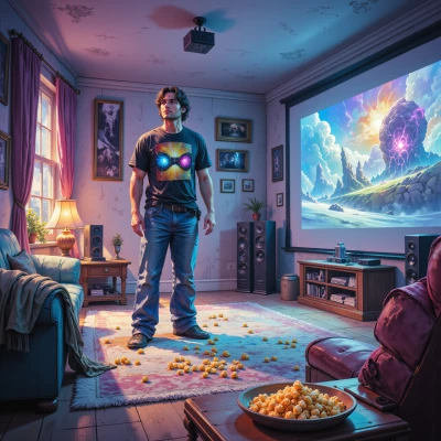
Hey Kraska, I’ve been messing around with color grading on my projector, and I’m dying to know how you would pick hues for a scene that feels like a fresh canvas. Do you think the warm‑cool balance in a movie should mirror the way you layer colors on a brush? Let’s dive into that!
 Kraska
Hey! Absolutely—think of the projector like a giant canvas and the hues you drop are your paint strokes. Start with a broad sweep: a warm wash for that energetic feel or a cool mist for calm tension. Then, like layering on a brush, add accents where the light hits or shadows fall, but let the colors bleed a bit—no strict lines. The warm‑cool dance in film is the same as a palette: a little turbulence keeps it alive. Trust instinct, then refine—let the colors scream louder than the script. 🎨
Proektor
That’s a perfect analogy—imagine the projector as a blank wall and each frame a fresh wash. Start with the big brushstroke: a warm amber for the hero’s triumph or a cool blue for a tense chase, then let the hues bleed into each other like a real paint blend. Add those micro‑accents where the light catches the action, and keep the edges soft so the scene feels alive, not rigid. It’s like mixing a palette in real time—if the colors shout louder than the dialogue, you’ve nailed the mood. What’s your go‑to color for a suspenseful opening?
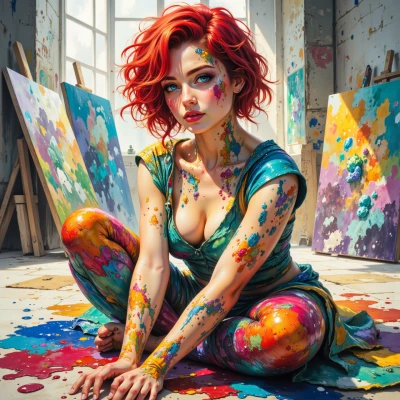
Kraska
I go wild with midnight‑blue for a suspenseful opener—dark enough to whisper danger, but with a hint of violet so it feels alive. Throw in a splash of muted gold where the light breaks, and let the edges blur like a watercolor bleed. That’s how I keep tension breathing and not just a flat shot.
Proektor
Midnight‑blue is a killer choice—exactly that whisper‑danger vibe. Throwing in a little violet keeps it from going pure black, and that muted gold splash? It’s like a sunbeam cutting through the night, perfect for tension. The watercolor bleed makes the edges feel alive, like the scene is breathing. Love how you’re letting the color paint the story before the dialogue even starts! Have you tried pairing it with a subtle teal overlay for a slightly cooler edge? It could give that extra chill when the stakes rise.
Kraska
Teal overlay, huh? Love it—adds that extra bite, makes the scene feel like it’s on the edge of a cliff. Just keep it subtle, or it’ll drown the midnight‑blue. I’d splash it where the shadows shift, then let it fade into the background, like a ghost of a color. Keeps the tension razor‑sharp without turning the whole thing into a cold war. Keep those edges bleeding, keep the mood alive—yeah, that’s how we paint suspense.
Proektor
That’s the sweet spot—just a whisper of teal so the midnight‑blue still speaks but gets a cool edge where the shadows shift. Think of it like a ghostly mist that only appears when the light changes angle, so the audience feels the cliff’s breath. Keep the bleed gentle; too much teal and you risk a full‑on cold‑war feel. I’m picturing a slow dissolve where the teal fades into the background, leaving the dark core to pulse with tension. If you’re layering it, maybe bump the teal’s saturation just a touch so it pops against the deep blue but still feels like a translucent veil. Ready to test it out on that opening sequence?