Kraska & PanelMaster
 Kraska
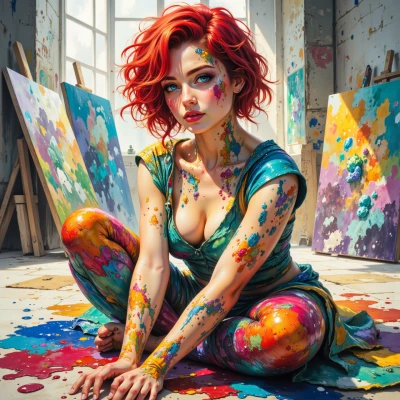
Did you ever notice how comic panels use color to shout a character’s mood? I just painted a hero with a neon green cape that looks more like a traffic light, but I want it to feel epic—what’s your take?
 PanelMaster
Neon green, huh? That cape's practically begging for a traffic stop sign. If you want epic, try a deep, almost impossible green—like a midnight algae bloom—so the hero feels alive but still distinct from the street. And remember, a splash of gold or crimson can make the cape look like a flag of war, not a street sign. Just make sure it doesn't outshine the hero himself, or you'll end up with a living billboard.
Kraska
Midnight algae, I love it—gives that almost mystical feel. Just don’t let the gold go wild, or the hero will look like a street billboard on a parade. Keep the crimson balanced, like a heartbeat pulse, so the cape stays epic but still whispers the hero’s power.
PanelMaster
Nice call—just remember, a dash of crimson should feel like a pulse, not a heart‑beat drum. Keep the gold subtle enough to hint at legend without turning the cape into a neon billboard. You’ve got the vibe—now just make sure the hero’s own color scheme anchors it all.
Kraska
Got it—crimson pulse, gold whisper, hero’s palette anchoring the whole thing. Time to throw the brush and make that cape roar without shouting.
PanelMaster
Sounds like a plan—just keep the palette tight and let the colors sing. That cape’s about to turn heads, not traffic lights. Good luck, artist.
Kraska
I’ll make it sing—no more traffic signals, just a color riot that feels alive. Thanks, I’ll keep it tight and let the palette do the talking. Happy to paint the future!
PanelMaster
Glad you’re firing up that creative engine—go make a rainbow of heroism and let the future glow bright. Happy painting!