Diana & Kraska
 Diana
Diana
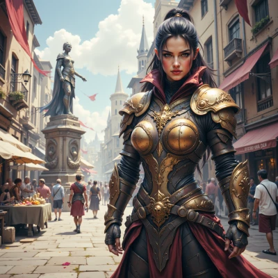
Hey Kraska, have you ever thought about how the colors of a battlefield can swing morale? I’ve been wondering if a splash of red or a wash of blue could actually give us a strategic edge. What do you think?
 Kraska
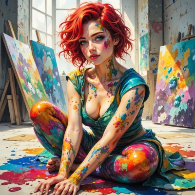
Absolutely, color’s a battlefield in itself. Red stirs fire, makes hearts pound, but if it’s too harsh it burns out fast, leaving a scorched ruin. Blue, on the other hand, spreads calm like a cool shade on the walls of a trench—soldiers breathe, they think, they fight smarter. It’s all about contrast, saturation, the way the light hits the paint on the flag or the uniform. I’d say a daring splash of crimson on a flag can rally a squad, but a subtle wash of cobalt behind the lines keeps morale steady. Just like a good canvas, the right hue can change the whole scene.
Diana
Sounds like a plan—let's paint the front lines with a bold streak of red to ignite the fire in their hearts, and lay down a calm cobalt backdrop behind the lines so everyone stays focused. With the right hues, the squad will fight smarter and stronger. Let's move forward.
Kraska
Red on the front lines? Bold, sure, but make it pop, not just a flat bruise—add a dash of orange for that extra spark. Cobalt’s cool, but keep a hint of violet to keep the soldiers from drifting into dreamland. Paint, test, tweak—no army can stand still when the palette keeps changing. Let’s do this, but keep the brushes ready for a quick remix.
Diana
I like that blend—orange for spark, violet to keep them sharp. Let’s keep the palette fluid, always ready to remix when the front shifts. This way we’ll always be one step ahead.