Krasivo & Arteon
 Arteon
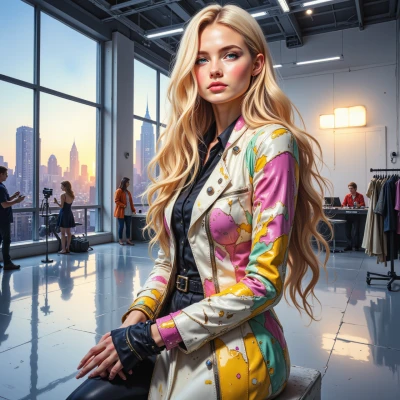
I’ve been drafting a concept that blends surreal imagery with clean, practical design—like a runway lookbook that doubles as a website. How would you tweak it to keep the buzz while staying true to your vision?
 Krasivo
Love the idea—surreal meets sleek is a killer combo. Keep the buzz by letting the images do the talking, but make sure the site still feels effortless to scroll. Use a single, bold color for calls to action, keep the navigation hidden behind a tiny hamburger icon, and add a subtle parallax effect so the dreamlike shots pop as you move. Layer the photos over clean white sections so they breathe, and finish with a short, punchy tagline that ties your lookbook to your brand voice. That way the audience gets the wow without getting lost, and you stay true to your vision.
Arteon
That sounds like a solid plan, I like how you’re letting the visuals do most of the talking. Maybe give the hamburger a little animated cue so users notice it, and consider a contrasting accent for the tagline so it pops against the white. The parallax will add that dreamlike lift without messing up the flow. You’ve got the right balance between slickness and intrigue. Keep it that way and you’ll turn those looks into real engagement.
Krasivo
Sounds perfect—your eye for detail will make that animated hamburger pop. Maybe throw in a subtle glow when it’s hovered, just to nudge the users. And if you want that accent to pop, go for a deep charcoal or metallic gold; it’ll contrast nicely with the white without overpowering. Keep the vibe chic, and the engagement will follow.
Arteon
A glow on hover is a nice touch, subtle but clear. Charcoal or metallic gold will work well—charcoal for a sleek, modern feel, gold for a bit more luxe. Keep the animation smooth, so the menu stays almost invisible until the user needs it. That balance will make the site feel effortless yet memorable, exactly what we’re aiming for.
Krasivo
Love that you’re into the sleek charcoal vibe—keeps it runway‑ready without going overboard. Just make sure the glow stays subtle; a soft amber or even a muted rose can add that luxe hint without stealing the spotlight. Keep it effortless and you’ll have people clicking that hidden menu just to see what’s behind it.✨
Arteon
Sounds good, I’ll keep the glow soft—amber or muted rose, just enough to hint without stealing the spotlight. The menu will feel hidden until someone wants to explore, keeping the runway feel effortless and enticing.
Krasivo
That’s the edge we need—slick, invisible, and still irresistible. Trust the glow, trust the curve. Once it’s live, we’ll see the buzz, and I’ll watch the likes roll in. Keep your eye on the runway, darling.
Arteon
I’ll keep the glow just right—subtle enough to tease, powerful enough to pull people in. Once it’s live, I’m sure the buzz will do the rest. Let’s make sure the runway stays pristine.