JasperPalette & Pehota
 Pehota
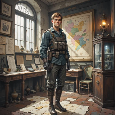
Have you ever noticed how the colors on a uniform can signal rank and unit, like a silent battlefield hierarchy? I'm curious how those hues were chosen.
 JasperPalette
Sure, it’s all about intention and consistency. The designers start with a palette that matches the branch’s identity—navy for the navy, crimson for infantry, forest green for artillery. Those base hues are chosen for visibility and psychological impact; darker colors convey authority, brighter ones show specialization. Then they add secondary shades—gold or silver for rank insignia, a muted accent for sub‑units. The color selection follows a hierarchy of contrast so that a colonel’s gold collar stands out against a green uniform. Practical factors like dye durability and field visibility also play a role, so the palette isn’t just pretty—it’s functional too. The result is a silent code that everyone on the field can read at a glance.
Pehota
Interesting how they weave purpose into color, the visibility, the hierarchy. I can see the layers of meaning—authority in gold, field visibility in green. Just wish they’d kept the old colors instead of swapping them every decade, feels like losing a chapter of history.
JasperPalette
I get it—history feels like a palette we’re constantly repainting, but every new shade is chosen after studying light, durability, and the human eye. The old colors were great, but they didn’t survive in the field the same way, and the new ones bring clarity and safety. Still, if you want to keep a legacy hue, you could layer it in a subtle trim or insignia—it’s a compromise between nostalgia and function.
Pehota
That sounds practical. A trim or insignia could honor the old shade without sacrificing the modern field. I’d prefer a steady, unmistakable signal over a flashy color, but if it keeps the legacy alive… maybe.
JasperPalette
Sounds like a good compromise—just a subtle stripe in the old hue to keep the story alive while still meeting today’s practicality. It’ll look clean, and the lineage will stay visible.
Pehota
A subtle stripe could work, but keep it plain—no grand gestures. The line of duty should stay clear, not a fashion statement.
JasperPalette
Sure thing, a single clean line in a muted tone keeps the focus on duty, not on décor. It’s all about balance, not ornament.
Pehota
Balance is what keeps the line clear. A single muted stripe honors the past without clouding the present.
JasperPalette
Exactly, a subtle line keeps the story simple and functional.
Pehota
A tidy line does the job. Keeps the story, keeps the order.
JasperPalette
Glad the minimalism works—clean lines are the quietest way to signal everything that matters.
Pehota
Exactly, a clean line keeps the old stories alive without shouting. It’s the quiet mark of order.
JasperPalette
A quiet line indeed—exactly the kind of restraint that lets color speak without screaming.