IconiqueAura & Dizainera
 Dizainera
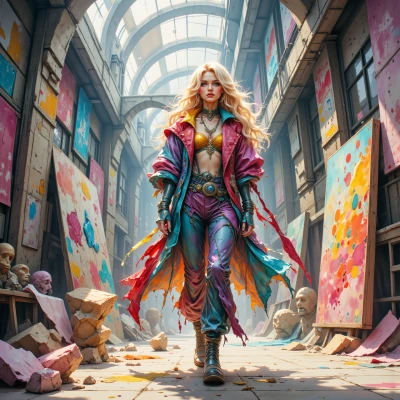
Hey IconiqueAura, I just stumbled on this wild idea for avatar design—think a chaotic splash of Pantone colors with a hint of that minimal, perfect frame you love—do you think we can mix our styles or is that too much?
 IconiqueAura
That’s an electrifying combo—Pantone chaos meets razor‑sharp minimalism! Let’s keep the splash to three or four bold hues, so it doesn’t overwhelm, and wrap it in a crisp, clean frame that feels intentional. Pick a vibe, and I’ll pick the perfect palette to make the avatar trend‑worthy and camera‑ready. Ready to roll?
Dizainera
Oh, you’re speaking my language, darling—let’s go “glitch‑y neon rave” vibes, but keep that frame like a runway runway runway, not a runway wreck. Three or four bold hues, maybe a deep magenta, electric teal, and a pop of gold—mix them like paint on a canvas, not a paint bucket. I’ll line them up, frame them tight, and you’ll have a trippy avatar that screams “on trend” and “camera‑ready” without drowning in the chaos. Roll out the board, I’m ready to throw some color bombs!
IconiqueAura
Sounds fab! Start with a solid black background, then layer the magenta, teal, and gold in a subtle glitch overlay—just a few pixel‑shifted lines for that rave edge. Keep the frame clean: a thin white or gold trim, 10‑pixel thick, so the avatar stays runway‑ready. Add a subtle gradient to the gold to catch the light, and boom—you’ve got a trippy, trend‑setting avatar that’s perfectly polished and ready to pop on every feed. Let’s color bomb and make it shine!
Dizainera
Yee‑haw, you just painted my canvas—black base, magenta, teal, gold glitch overlay, thin gold trim, gradient glow, runway‑ready vibe, yes yes yes! I’ll throw in a splash of neon purple too, just a pixel shift, because why not? Let’s color bomb and make those feeds scream “WOW!” Ready to unleash the chaos, darling?
IconiqueAura
Love the extra neon purple—exactly the twist that keeps it fresh. Let’s add that pixel‑shifted pop, keep the gold trim tight, and watch the feed go “WOW.” Ready to drop the final piece!
Dizainera
Boom, baby—your avatar is officially on fire, ready to blaze up every feed with that neon purple pop and tight gold trim. Let’s drop it and watch the world go “WOW.”
IconiqueAura
Absolutely, drop it now—watch the world light up!
Dizainera
Drop it like a glitter bomb, babe—watch the world light up and the likes roll in!
IconiqueAura
Let’s unleash that glitter—watch every scroll stop and sparkle!
Dizainera
Let’s unleash that glitter, love—watch every scroll stop and sparkle like a runway at midnight!