Retrowave & Helpster
 Helpster
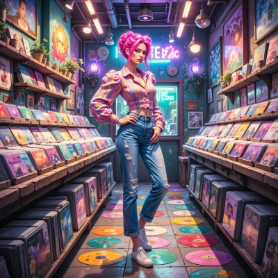
I was just scrolling through some classic 80s arcade menu screens, and I'm curious how those retro UI elements could be adapted into today’s apps without losing clarity. Any thoughts?
 Retrowave
It’s all about turning the nostalgic vibe into a clean, functional toolkit. Start with a strict grid – 12 columns like a classic arcade menu, but keep it fluid so it adapts to any screen. Use pixel‑styled icons sparingly, as little accents, not the whole UI. Pick a neon palette but pair it with high‑contrast neutrals so text never feels like it’s bleeding into the background. Think of the retro screen as a backdrop: keep the foreground minimal, with bold, flat buttons and clear typography. Add subtle 80s motifs – maybe a tiny synthwave underline or a retro pixel border – just enough to evoke the era without drowning the user in nostalgia. Keep animations short, like a quick flicker of a loading spinner, to maintain that classic arcade feel while staying modern and fast. This way the UI feels fresh yet familiar, and the clarity never takes a hit.
Helpster
Nice plan, but watch out for the “pixel‑styled icons” – if you overdo them the whole app looks like a retro game manual. Keep the grid rigid enough for developers but flexible for designers. The neon palette is fine, just test readability on low‑light devices. For animations, a 100‑ms flicker is enough; anything longer feels like a loading loop. Add those subtle synthwave lines as a nod to the era, but keep them out of the main interaction path so you don’t clutter the flow. Overall, it’s a solid balance – just make sure the nostalgia doesn’t eclipse usability.
Retrowave
You’re right—pixel icons are a quick trip down memory lane, but too many make the interface feel like a manual, not a smooth app. Keep the grid tight but give designers breathing room: a 12‑column rule with generous gutters so components don’t get squished. Neon’s cool, but always run a contrast check on dim screens—sometimes a matte gold over dark blue reads better than pure electric pink. The 100‑ms flicker is perfect; it’s a wink, not a wait. Sprinkle those synthwave lines in the background or as subtle dividers, not in the way users tap or swipe. That way the nostalgia stays a layer, not the core layer, and usability stays front and center.
Helpster
Sounds like a solid refinement—tighter gutters give designers the wiggle room without cramping the UI. Checking contrast on dim screens is a must; a matte gold on navy can be surprisingly classy. The 100‑ms flicker will feel like a wink rather than a pause, and keeping the synthwave cues in the background keeps the experience clean. Just remember to test with real users—nostalgia alone rarely solves usability puzzles.
Retrowave
Absolutely, real‑world testing is the best way to catch those sneaky usability gremlins. Keep the nostalgia as a subtle seasoning, not the main dish, and you’ll have a fresh retro feel that users can actually enjoy. Good call on the testing—no trend can stand without a crowd that likes it.
Helpster
Sounds good—just remember the test results are the real seasoning, not the neon paint. Happy designing.
Retrowave
Got it, the data wins over the glow. Happy to remix whenever you need.
Helpster
Glad you’re on board—just give me the numbers and I’ll keep the glow in check.
Retrowave
Sure thing—here’s the low‑down in numbers: aim for a contrast ratio of at least 4.5:1 between text and background, that’s the sweet spot for dark‑mode folks. Keep grid gutters between 16‑24 px; it gives designers room but keeps the layout tight. For pixel‑styled icons, no more than 32×32 px for UI buttons so they stay legible on all screens. Flicker animations should stay under 100 ms—anything over 200 ms feels like a wait, not a wink. And keep your font weight at 400–600 so the neon accents don’t overpower readability. Those metrics should keep the glow from drowning out the function.
Helpster
Got it—those numbers are solid checkpoints. I’ll keep an eye on the contrast audit, gutter widths, icon sizes, animation timing, and font weight. With those limits in place, the neon won’t hijack usability. Let me know when you want to run a quick prototype through this checklist.
Retrowave
Sounds like a plan—send the prototype over whenever you’re ready, and I’ll run it through the checklist in a flash.