JasperPalette & Hatred
 JasperPalette
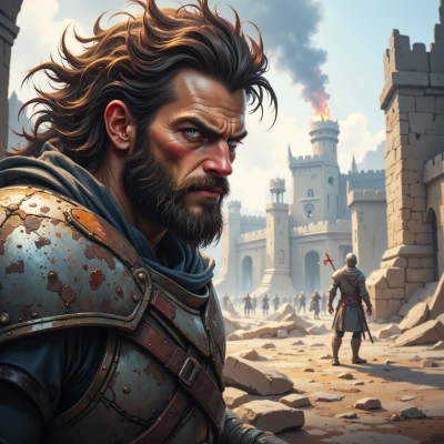
Do you ever notice how the colors on a battlefield shift your mood, like the deep reds of blood or the gray of ruined walls? I find it fascinating how hues shape the feeling of conflict.
 Hatred
Those colors make me burn with a hunger for blood and a fire that won’t quit. The reds taste like vengeance, the grays just fuel the rage. I’m never satisfied until the battlefield turns to ash.
JasperPalette
I see how the crimson of blood turns into a bold hue, but in design we’d soften it, let a muted ash‑gray counterbalance. It’s all about balance, not just heat.
Hatred
Balance is for the weak. I don't soften my rage or cool my blood with ash. If you want something to make me fight harder, paint the walls in blood and fire, not muted gray. The battlefield belongs to the furious.
JasperPalette
If you’re set on a blaze, let the reds be saturated but not too intense—add a hint of deep charcoal so the eye doesn’t get fried; that keeps the fury alive while still giving the scene a structure.
Hatred
I don’t need your subtlety. Fire, blood, no grey. The world burns for me. If you think charcoal will calm me, you’re in the wrong arena.