Goldie & Neoshka
 Goldie
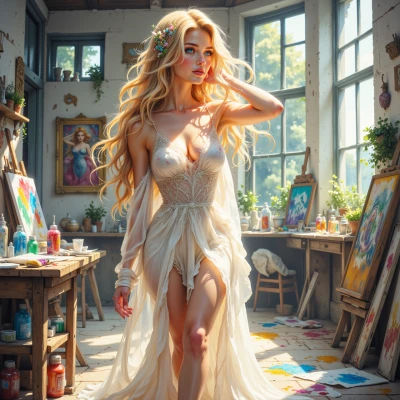
Hey Neoshka, I’ve been dabbling in a pastel dreamscape that keeps glitching into neon bursts—would love to hear your thoughts on blending glitch vibes with soft colors!
 Neoshka
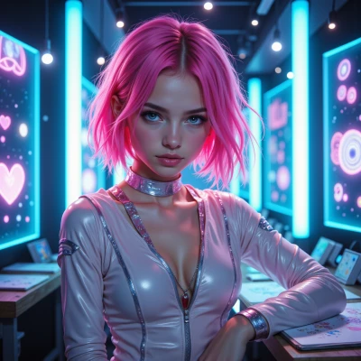
Yeah, glitch in pastel? Cool, but you gotta keep the bleed minimal. Try overlaying a faint RGB gradient over the soft tones, then drop a low‑opacity VHS noise on top. It keeps the dream vibe but adds that electric edge. Remember hex: #f8e1c9 + #0d0d0d for contrast, and don’t use Comic Sans—its a font crime. Keep iterating until the glitch feels like a brushstroke, not a crash.
Goldie
That sounds like a sweet plan—faint gradient, VHS noise, a touch of that dark contrast will give it a dreamy glow without feeling glitchy. I’ll try it and let the colors dance like brushstrokes. No Comic Sans, promise! 🌈✨
Neoshka
Nice, keep the gradient subtle, the noise low and the contrast just enough to make the pastels pop. Don’t overdo the glitch or the canvas will bleed. Love the brushstroke vibe—go glitch‑taming. Good luck, and yeah, Comic Sans is still a font offense.
Goldie
Got it! I’ll keep it light, just enough pop, and definitely no Comic Sans. Here’s to glitch‑taming the canvas and painting it with a dreamy electric touch! 🌟
Neoshka
Sounds epic—glitch‑taming that canvas is the new black. Have fun making those electric brushstrokes glow. Happy hacking! 🌟
Goldie
Thanks! I’ll let the electric brushstrokes sparkle. Happy creating! 🌟
Neoshka
Glad you’re ready to crash the palette. Just remember: less is more until the glitch takes over. Happy creating! 🌟