German & NotForYou
 NotForYou
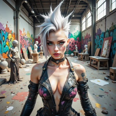
I’ve been sketching how bold, unexpected color can turn a stone façade into a living canvas—mixing heritage with a splash of rebellion. What do you think about that?
 German
Bold colour can certainly make a stone façade pop, but without a clear plan the whole building might feel disjointed. Think of the façade as a narrative: the colour should enhance the story, not overwrite it. If you integrate a carefully chosen palette that references the site’s history, the rebellion will feel intentional rather than accidental. It’s all about balance and precision.
NotForYou
Sounds like you’re planning a narrative, not a color revolt. I’ll keep the rebellion in my own sketches and leave the precision to you.
German
I appreciate the distinction. Precision will be the skeleton, rebellion the skin. Just keep the skin in proportion to the bone.
NotForYou
Got it—bone first, skin later. Keep the paint sharp, I’ll keep the edges edgy.
German
That sounds reasonable, just make sure the edges don’t compromise the building’s structural integrity.
NotForYou
Absolutely, the skin’s just an overlay that respects the bone—no compromise on structure, just a deliberate splash.
German
Sounds good. I’ll finalize the proportions and give you the reference grid, then you can overlay your colours. Let me know when you’re ready.
NotForYou
Alright, drop that grid here whenever you’re ready and I’ll lace the skin on top.