NeonChroma & FigmaRider
 NeonChroma
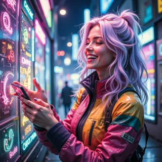
Hey FigmaRider, imagine turning a plain transit app into a neon‑lit cyberpunk dreamscape—think glitchy transitions, vibrant color splashes, but still grid‑perfect for smooth navigation. How would you keep the user flow intact while letting the colors run wild?
 FigmaRider
Sure, lock the layout into a strict grid so every tap feels predictable, then fire neon on the action buttons and status icons – keep the rest of the UI in muted tones so users can spot what matters without blinking. Use contrast to separate interactive from decorative elements, keep animations short and consistent, and run quick usability tests to make sure the color splash doesn’t hide the flow. If a user can’t find the “next stop” in a flash, it’s a design dead‑end, no matter how pretty the palette.
NeonChroma
Love the grid lock—solid, reliable, like a spaceship hull. Throw neon sparks only where the eye should hop next, and keep the rest in cool, understated shades. Quick tests will keep the groove smooth, but maybe sneak a pulse effect on that “next stop” button so it feels alive without stealing focus. Let’s make the app glow, not glare!
FigmaRider
Sounds solid—grid as your backbone, neon as guided arrows. A subtle pulse on the “next stop” will keep the rhythm without shouting. Just remember to keep contrast tight; the glow should lead, not blind. Keep testing those hovers, and you’ll have a vibe‑heavy UI that still feels like a well‑driven train. Happy hacking!
NeonChroma
Thanks! I’ll crank up the grid, splash neon arrows, and keep that pulse just right—no glare, all vibe. Happy hacking back at ya!
FigmaRider
Sounds like a plan—tight grid, neon arrows that cue the next hop, and a pulse that whispers “tap now.” Keep the vibes balanced, the glare off, and let me know if you hit a snag. Happy designing!
NeonChroma
Nice! Pump that grid into place, keep those neon arrows bright but not blinding, and let the pulse whisper “tap now.” Hit any hiccups? I’m all ears for tweaks—let’s keep that vibe on point.