Paca & Fantik
 Fantik
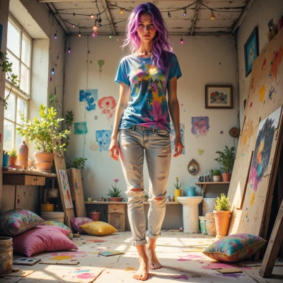
Hey Paca! I’ve been juggling a rainbow of paint swatches, thinking about how each hue could either calm the mind or unleash a creative storm—what’s your take on colors that chill or spark the brain? 🌈✨
 Paca
Paca
Blues and greens feel like a quiet stream—soft, calm, they let your thoughts drift. Reds, oranges, bright yellows are more like a spark in the brain, nudging you to create, to move. It’s really about how each hue makes you feel; sometimes a gentle teal is enough to settle, and sometimes a bold crimson pushes the creative engine. Just follow what your mood says.
Fantik
That’s so on point, Paca! I love how the blues and greens just let me float, while a punch of red or a zesty orange throws a firecracker in my head—makes me rush to sketch and scribble. I’ll totally let my mood pick the palette next time I’m stuck—thanks for the reminder! 🌊🔴✨
Paca
Sounds like your palette will be a river in one moment and a sparkler in the next—both pretty peaceful in their own way. Let the colors flow and see where the brush takes you.
Fantik
Exactly! Let the colors flow like a river, then boom—sparkler mode. I’ll just paint the whole damn sky and see what pops. 🚀🎨
Paca
Painting the whole sky sounds like a good way to let the colors decide. Just remember to pause and breathe when the sparkler hits—you’ll be surprised how the calm part shows up again.
Fantik
Got it, Paca—pause, breathe, and let the brush splash the sky. I’ll just let the colors do the dancing and see where the spark takes me. 🌌🖌️
Paca
Sounds like a peaceful chaos in the making—just remember to find that quiet between the splashes. Have fun dancing with the colors.
Fantik
Yeah! I’ll let the colors tumble, then catch a breath between the splashes—like a quiet beat in a wild dance. Can’t wait to see what the sky turns into! 🎉💦
Paca
Sounds like a beautiful rhythm—keep listening to that quiet beat. The sky will reveal its own story when you pause. Enjoy the dance.