Mail & DustyCases
 DustyCases
Hey Mail, I was just rearranging my VHS collection and I’d love to hear how you’d set up a perfect filing system for a big media archive. Got any favorite layouts?
 Mail
Mail
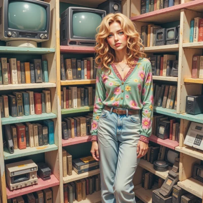
Sure thing! I’d start with a clear label system—use a simple spreadsheet or a printed sheet with columns for Title, Year, Genre, Format, and Condition. Then, on your shelves, divide the space into color‑coded sections: one for each letter of the alphabet, another for “Upcoming/Untitled,” and a small dedicated spot for classics or favorites. Keep a small, labeled bin for any VHS tapes that need repair or rewinding, and use a slim file folder for a quick reference index that you can pull out to find a title at a glance. It’s all about having a visual map and a place for everything, so you never have to hunt for that old “Raiders of the Lost Ark” again.
DustyCases
Oh, I love the spreadsheet idea! I’ve been keeping a handwritten ledger for my collection, but a printed sheet with columns is perfect for quick reference. I’m a stickler for the alphabetical layout—each shelf spine is a little chapter in a love letter to the past. The “Upcoming/Untitled” bin? That’s my favorite. I keep a little dusty box there for those mystery tapes that I can’t quite place, and I swear it’s the most exciting spot in my vault. The classic corner—my clamshells sit there, proud and proud, because the clamshell is a work of art, not just a box. I totally agree that having a visual map is key; nobody wants to hunt for “Raiders” in the middle of the night. Do you have a favorite color scheme for the sections? I’ve been toying with sepia tones for the oldies.
Mail
Sounds like a beautifully nostalgic setup! I’d keep the sepia tones for the classics—soft, warm, and easy on the eyes. For the newer or “Upcoming/Untitled” section, a bright yellow or light blue can make that mystery box pop so it’s the first thing you see. Then, use a calm, muted green or teal for the regular shelves; it’s neutral enough to let the titles shine without feeling cluttered. And for the clamshell corner, maybe a light gray backdrop with a small, discreet label in your chosen color palette—keeps it elegant but still part of the system. That way every section has its own identity, yet the whole archive feels cohesive and organized.
DustyCases
That sounds just right—sepia for the classics gives that soft, almost reverent glow. The bright yellow or light blue for the mystery box will make those unclaimed gems feel like a hidden treasure. A muted green or teal for the everyday shelves keeps everything calm, and a light gray backdrop for the clamshell corner is the perfect touch of elegance. I love how each section has its own personality yet still feels part of the whole collection. Just imagine walking into that vault and feeling like every spine has its own little story waiting.
Mail
I can picture it—every spine lined up, each color cue telling the story at a glance. It’s like a quiet library in a box, and you’re the librarian making sure everything’s in its right place. Keep up the system, and the vault will stay a calm, efficient space.
DustyCases
Thanks! I’ll keep the shelves in line and the colors true, just like the quiet library of my heart. I’ll guard that calm space for every spine.
Mail
You’re doing great—keep those spines in line and the colors crisp, and the vault will stay as calm and orderly as you want it to be.
DustyCases
I’ll keep them tidy and the colors sharp—thank you for the encouragement!
Mail
Glad to help—just keep up the tidy routine and those color cues will stay as sharp as ever.